Egglife
Cracking the code on healthy eating
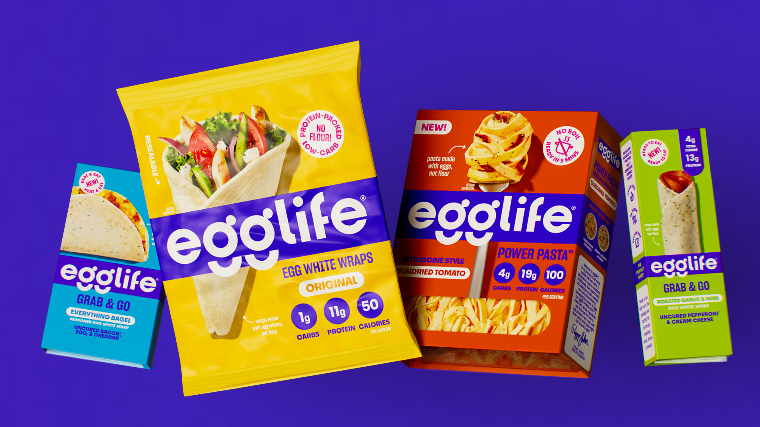
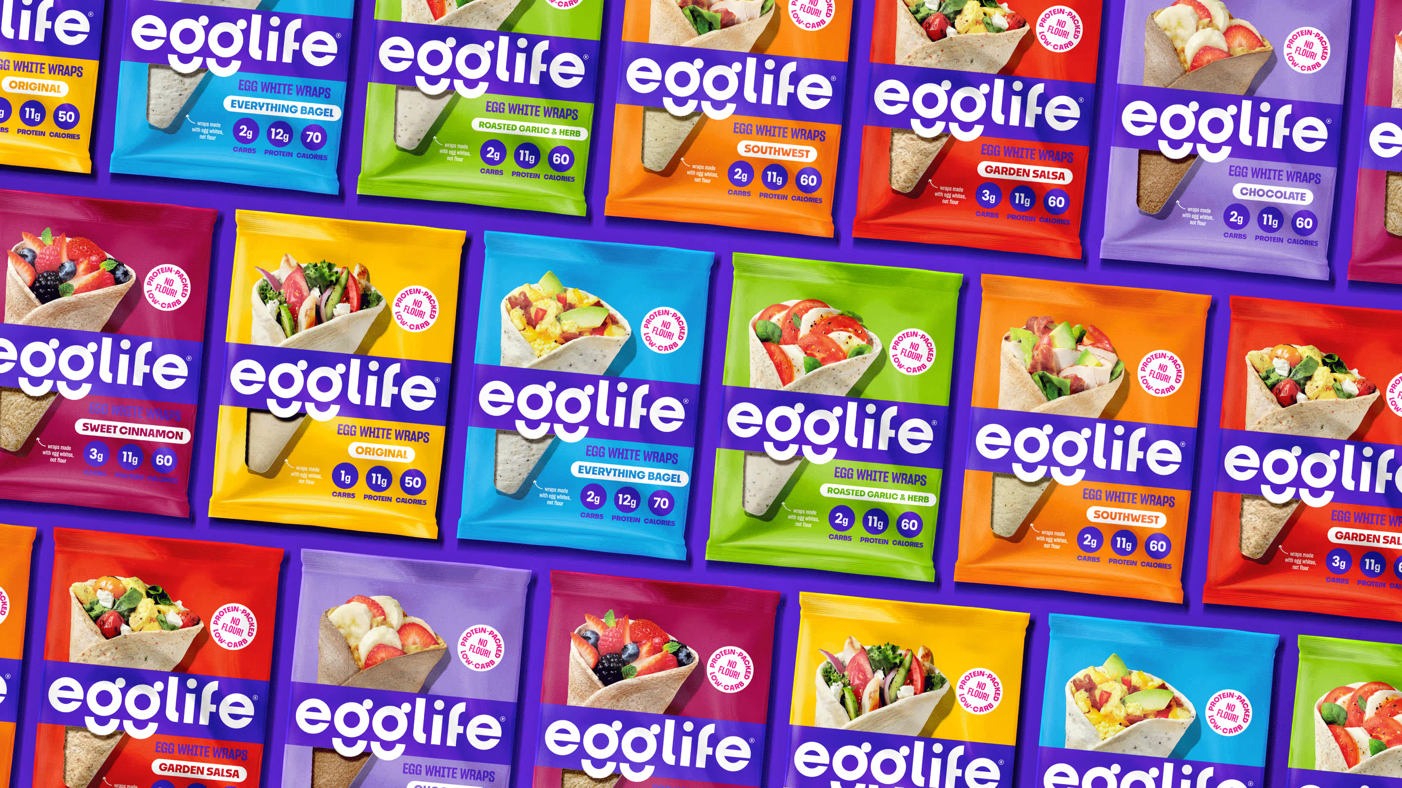
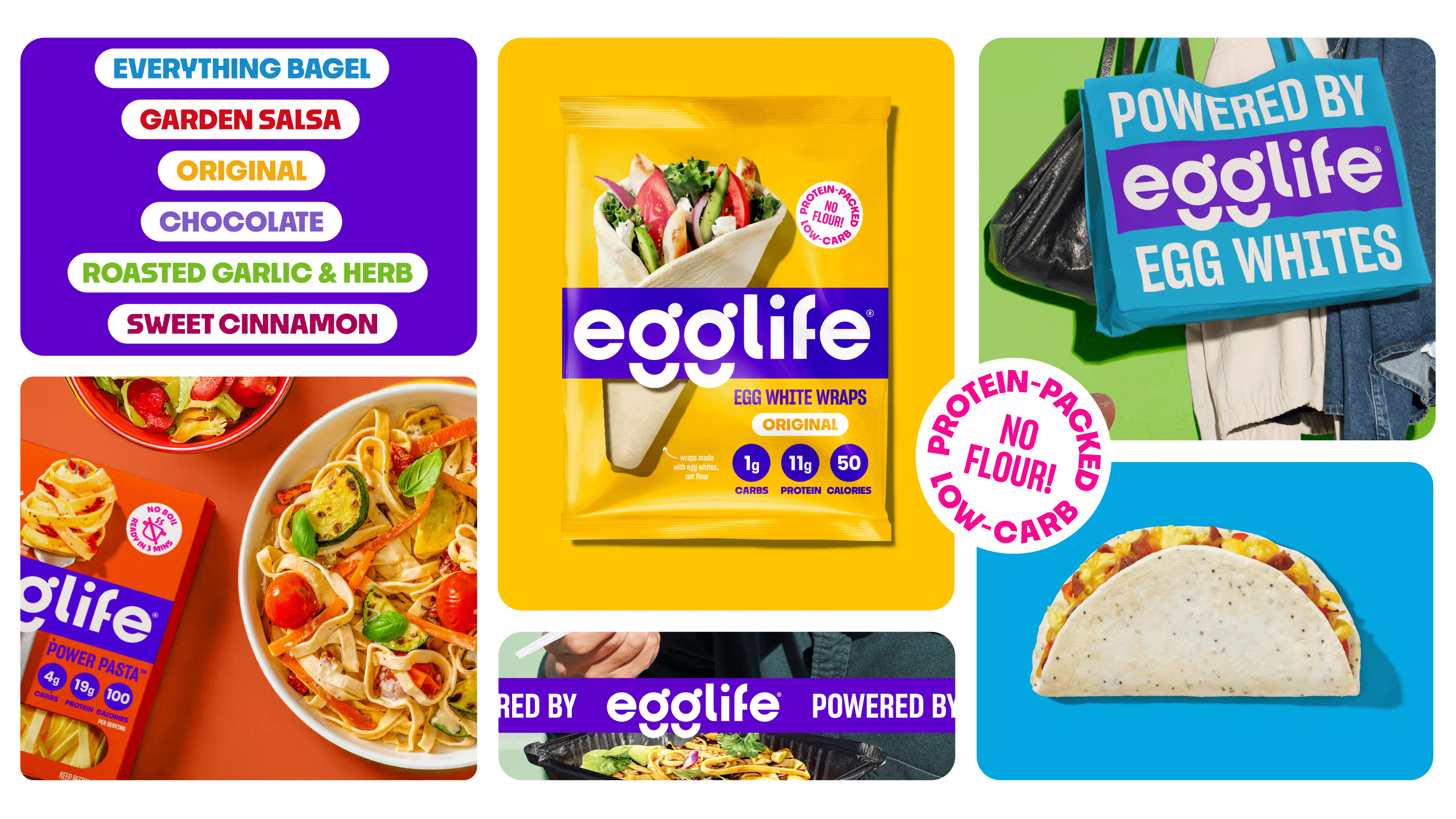
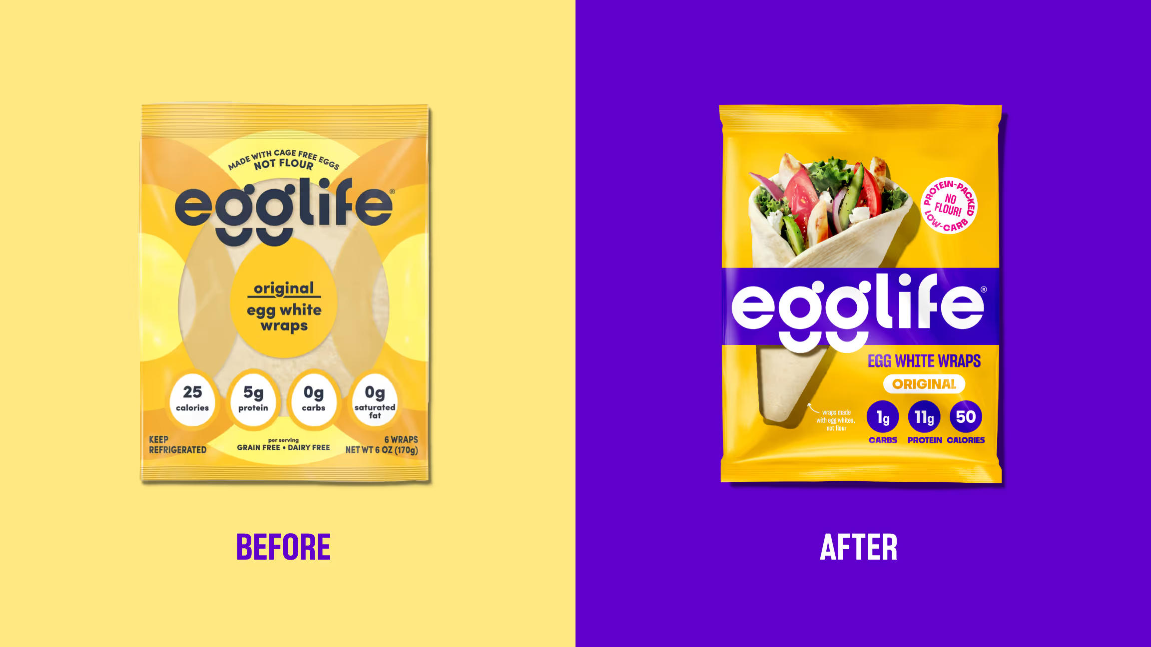
Egglife had already cracked the code on healthy wraps, swapping flour for cage-free eggs to deliver a low-carb, high-protein alternative people actually craved. With strong awareness and a loyal following, the brand had proven there was real demand for better-for-you options that didn’t compromise on taste. But with expansion into new categories on the horizon, it was clear Egglife needed more than a strong product. It needed a brand that could scale.
The wraps were winning—but the brand wasn’t yet built to:
- Break through in-store with a standout, craveable presence
- Drive differentiation and communicate category context
- Own an unmistakable identity, laying the groundwork for future category expansion and innovation
Brand Strategy
Brand Architecture
Design Strategy
Visual Identity
Packaging Design
SEE MORE PROJECTS
From online obsession to retail expansion
Putting the "hot" back in nestlé hotpockets.

Building on a viral sensation
Going bananas with a classic frozen treat
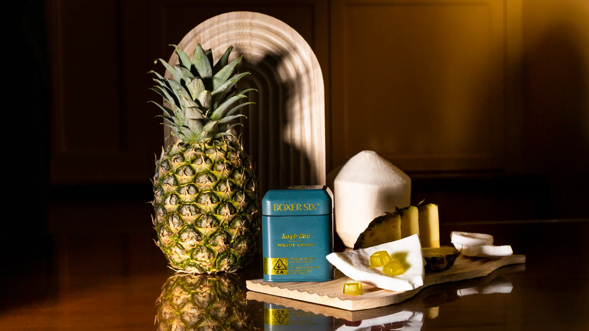
Tailored cannabis for those who tailor their lives
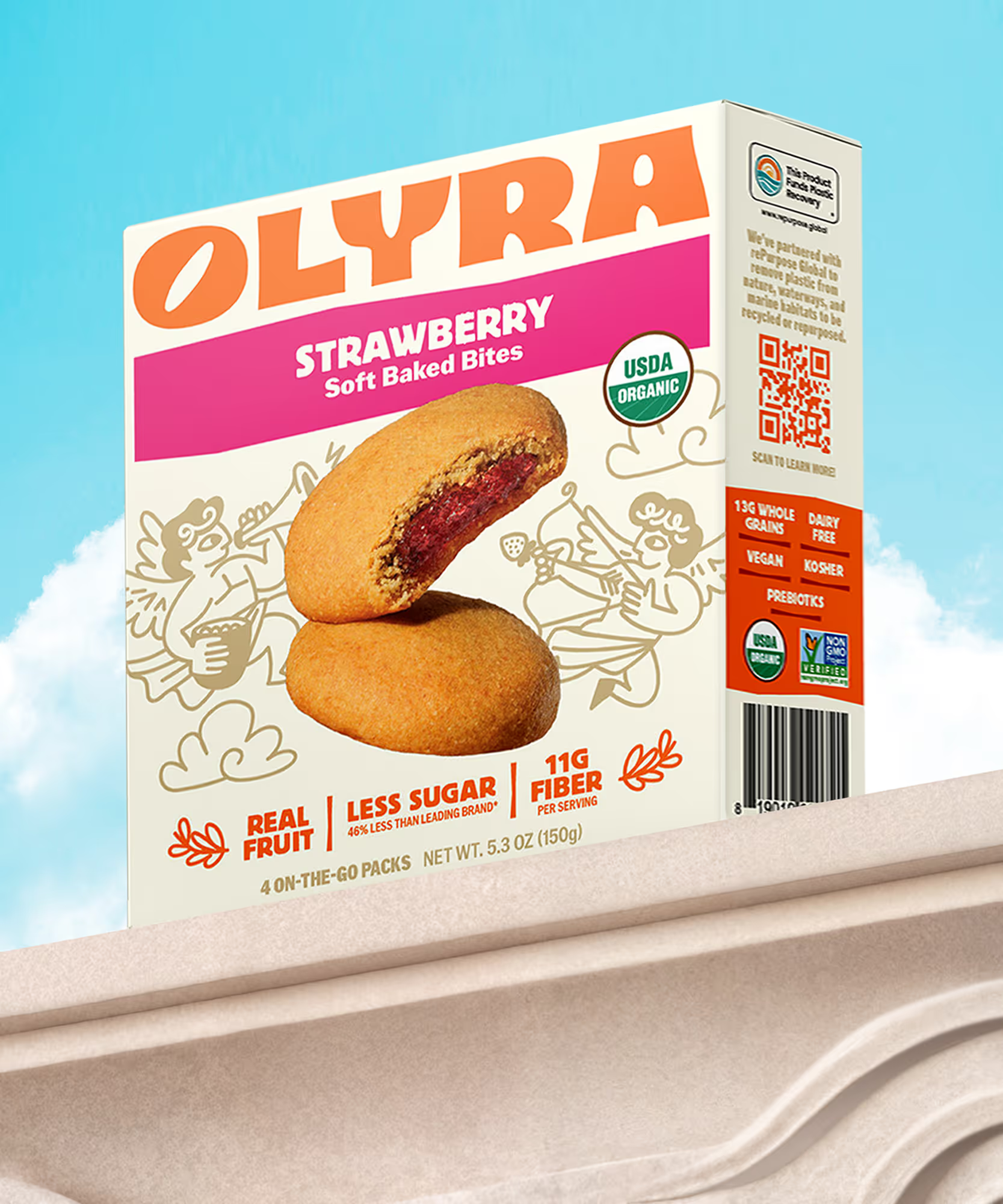
Rebranding from the grain up
The first supplement you actually want to take
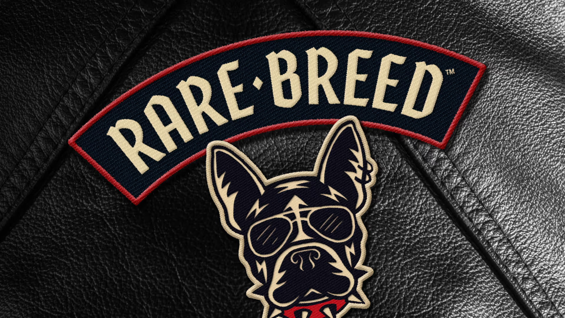
Creating a new leader of the pack

Making waves in wellness
Cereasly sexy
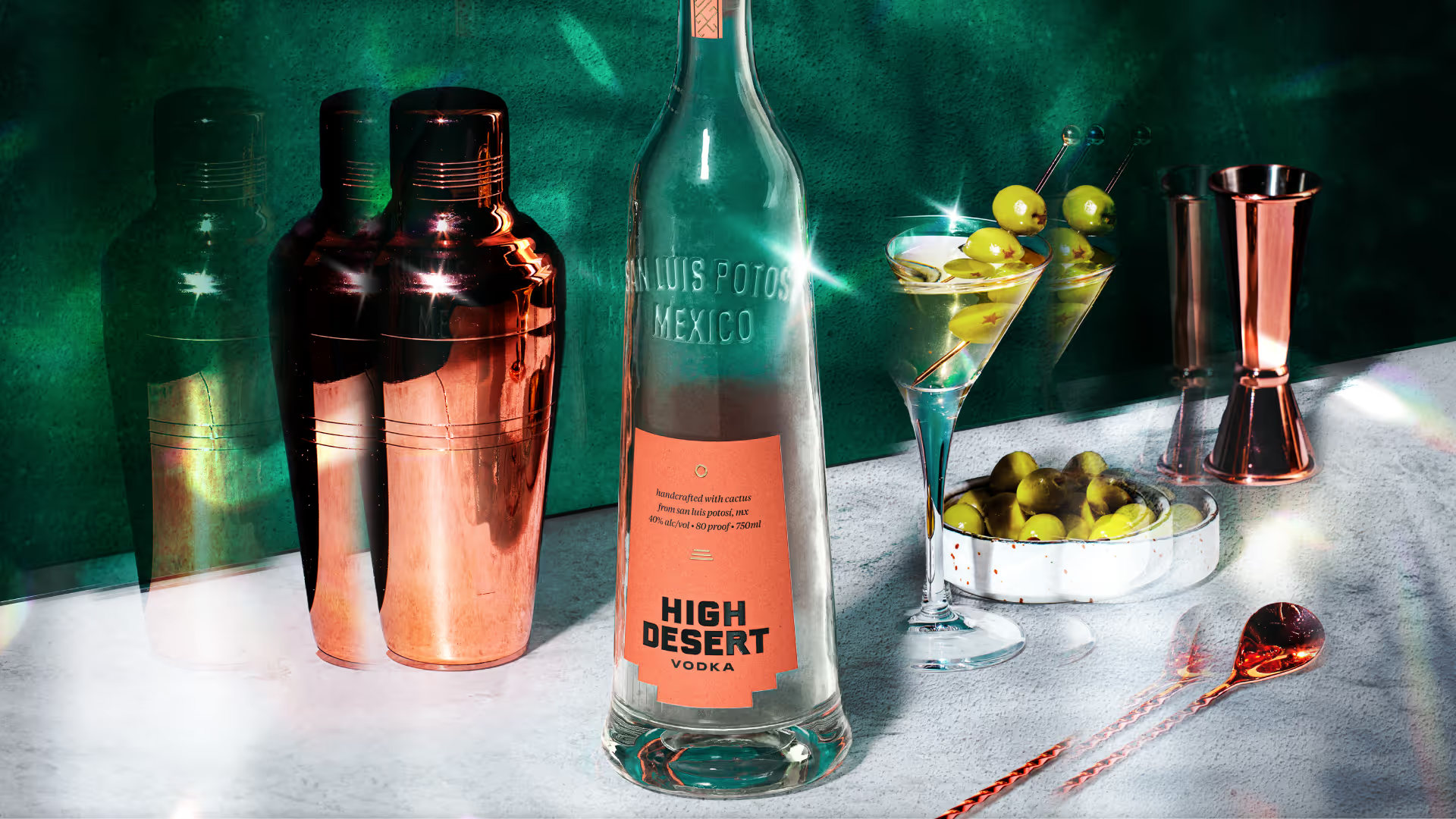
Distilling the spirit of the desert
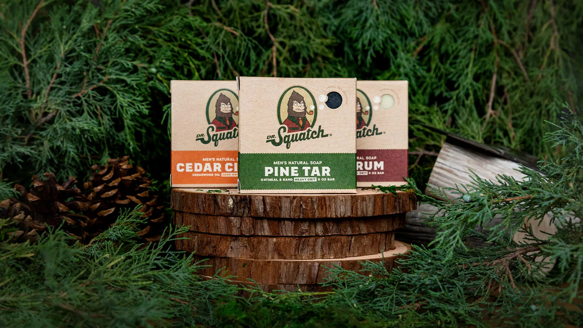
A bigfoot forward in design for men's personal care
Branding better-for-you cider

Creating a revolution in recovery
Cracking the code on healthy eating
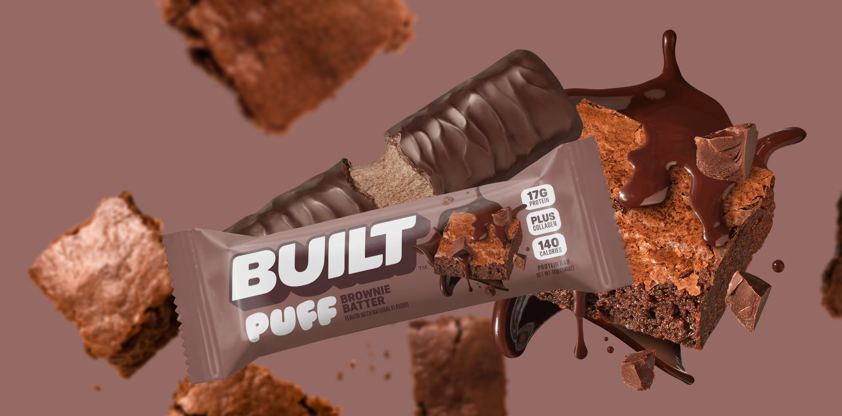
Satisfaction without sacrifice

Crafting the new generation of non-alc cocktails