OLYRA
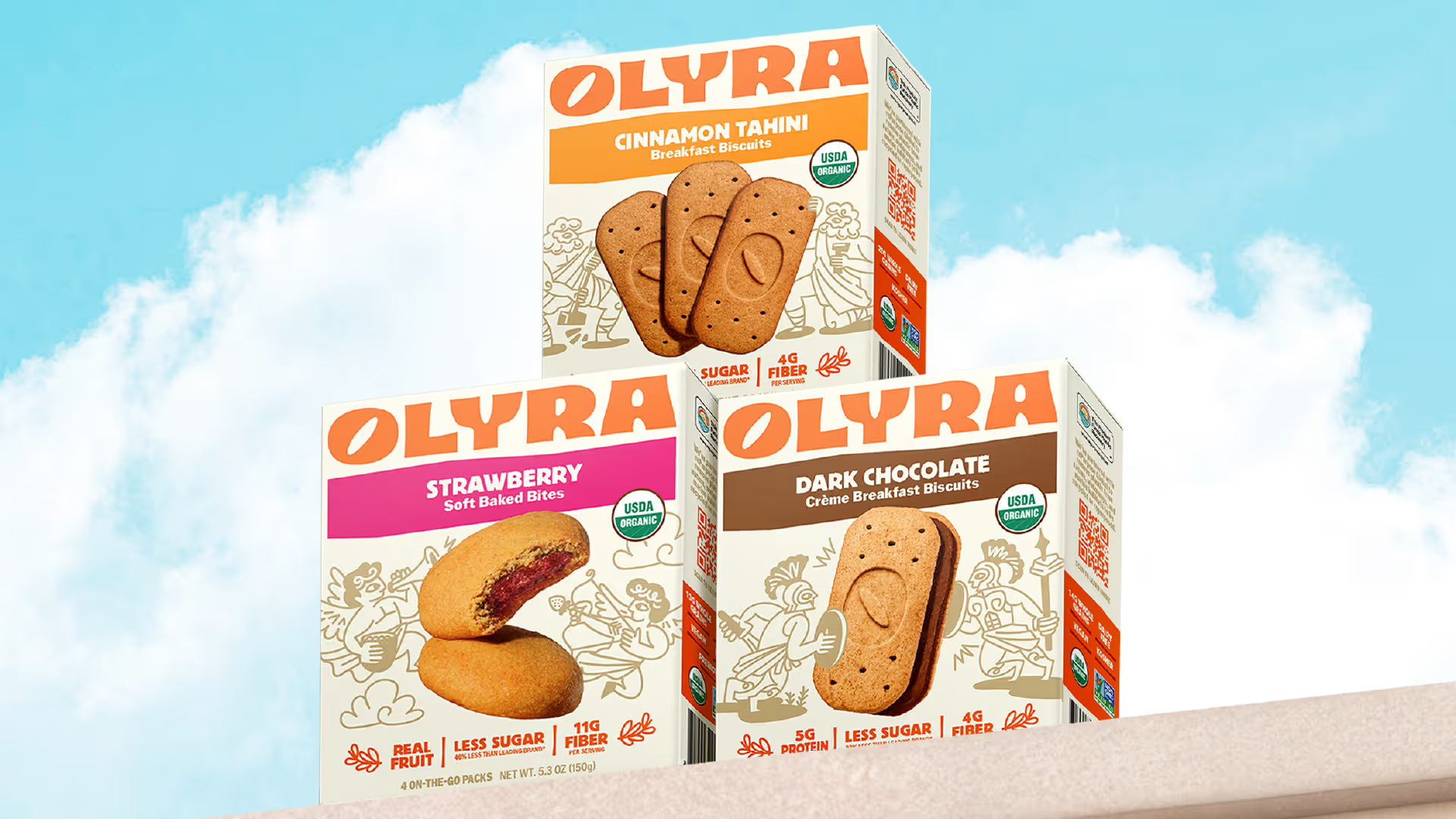
Rebranding from the grain up
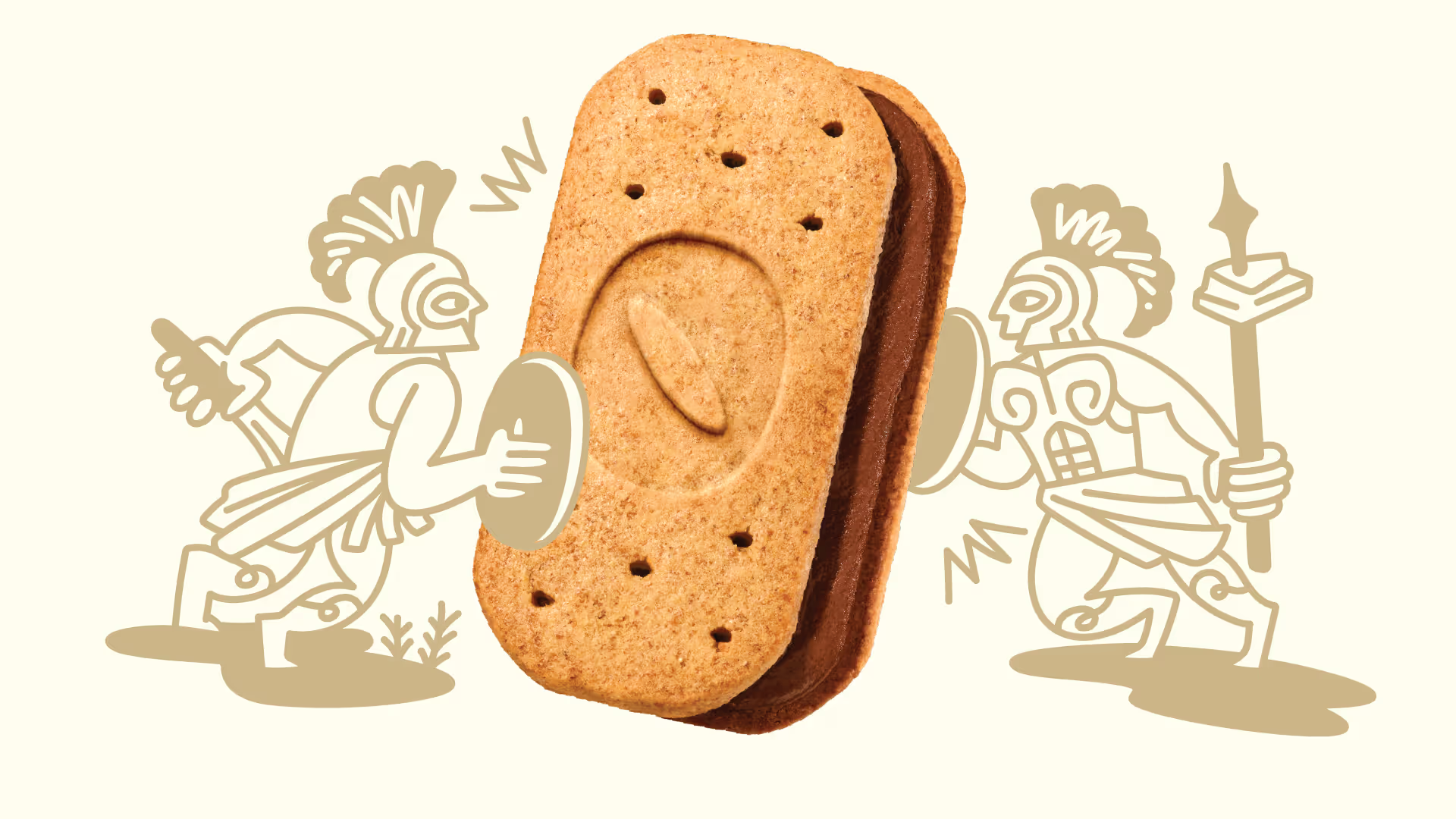
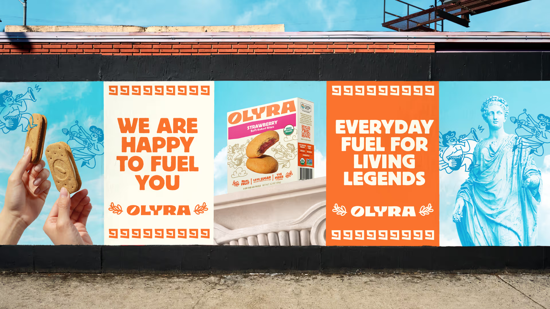
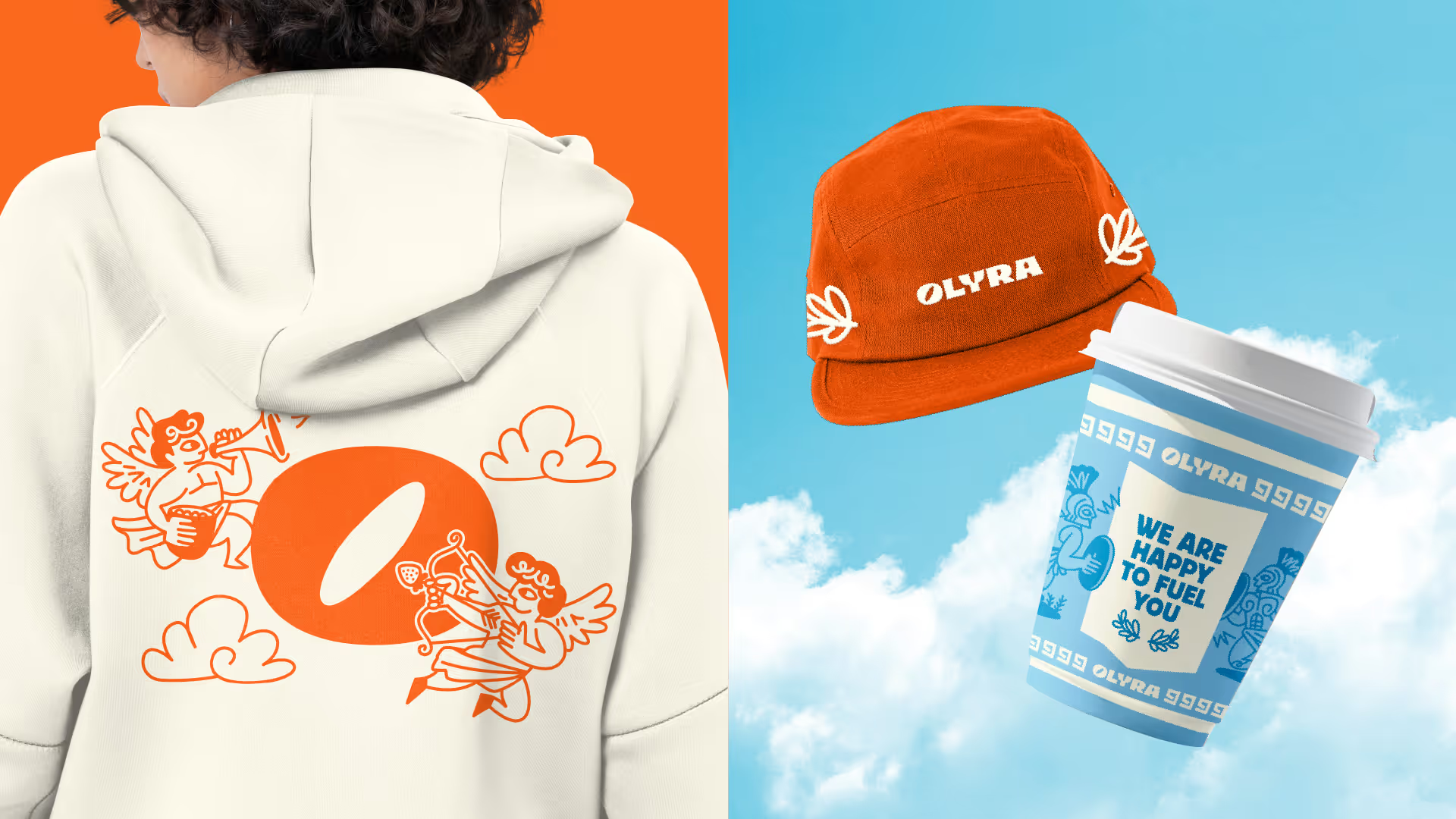
Olyra has always stood for something special: an ancient Greek lineage of stone-milled grains, baked into better-for-you snacks made for modern mornings. With organic ingredients, balanced energy, and a family tradition five generations deep, their products had the heart, but not yet the identity to match.
Olyra came to us at a pivotal point. They were ready to grow, with expanding distribution and new flavors in the pipeline. But their brand expression hadn’t caught up. The product was doing the work; the branding needed to rise to the moment.They needed a system that could do three things:
Brand Strategy
Design Strategy
Product Naming
Visual Identity
Packaging Design
Illustration & Photography
Brand Book

SEE MORE PROJECTS
From online obsession to retail expansion
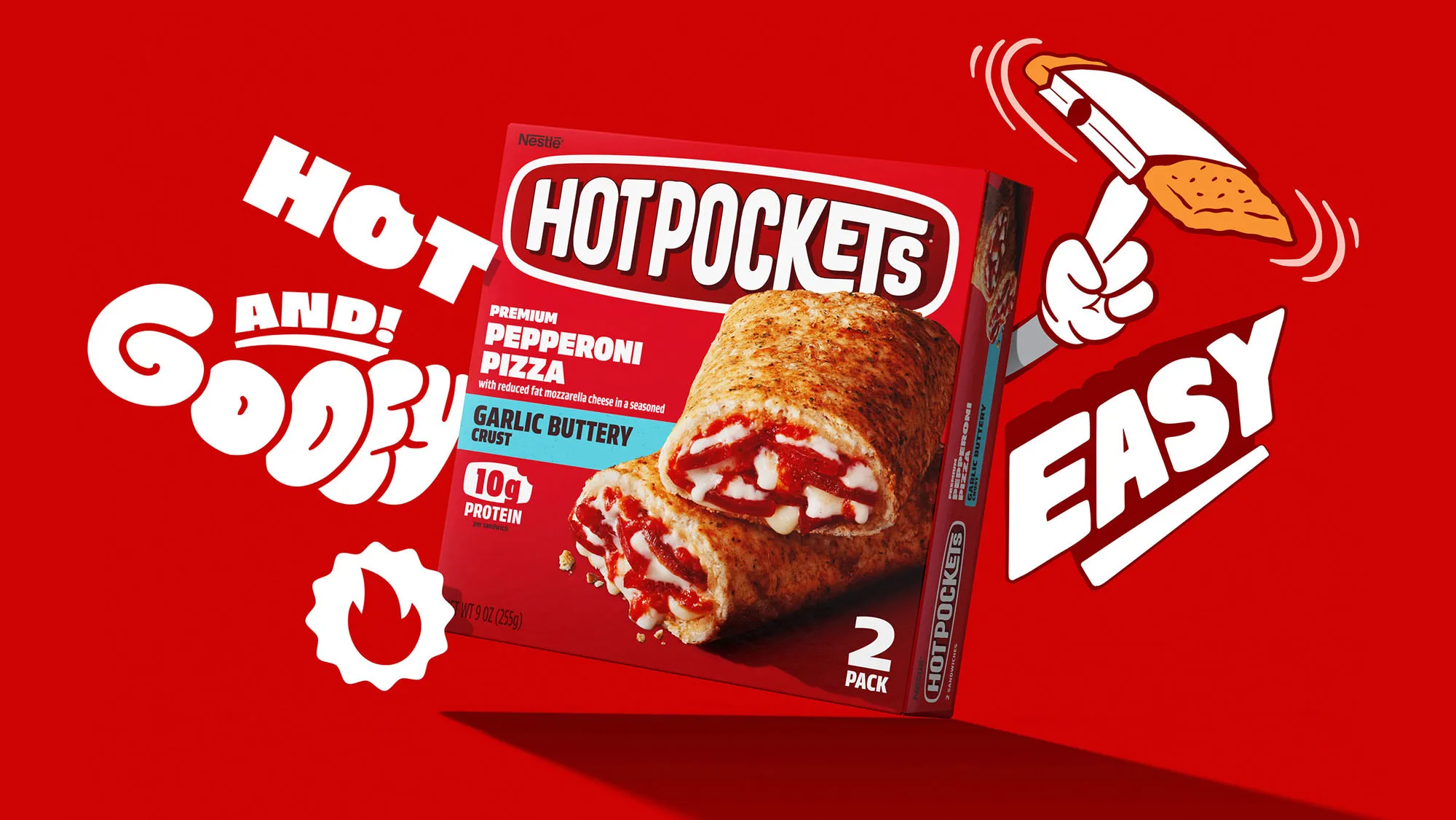
Putting the "hot" back in nestlé hotpockets.

Building on a viral sensation
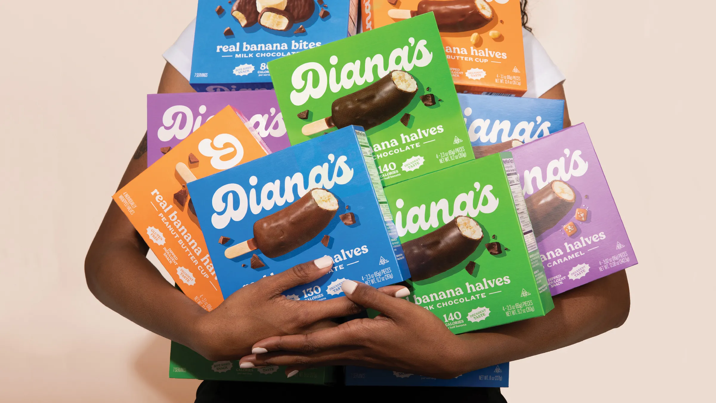
Going bananas with a classic frozen treat
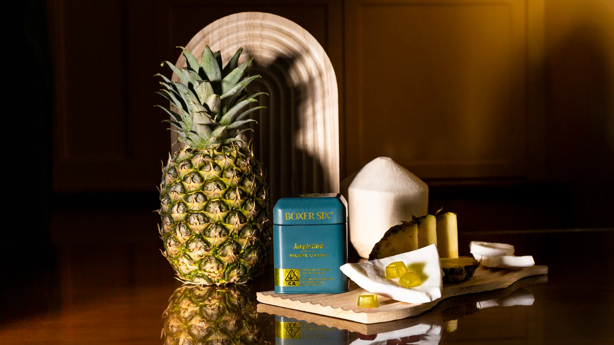
Tailored cannabis for those who tailor their lives
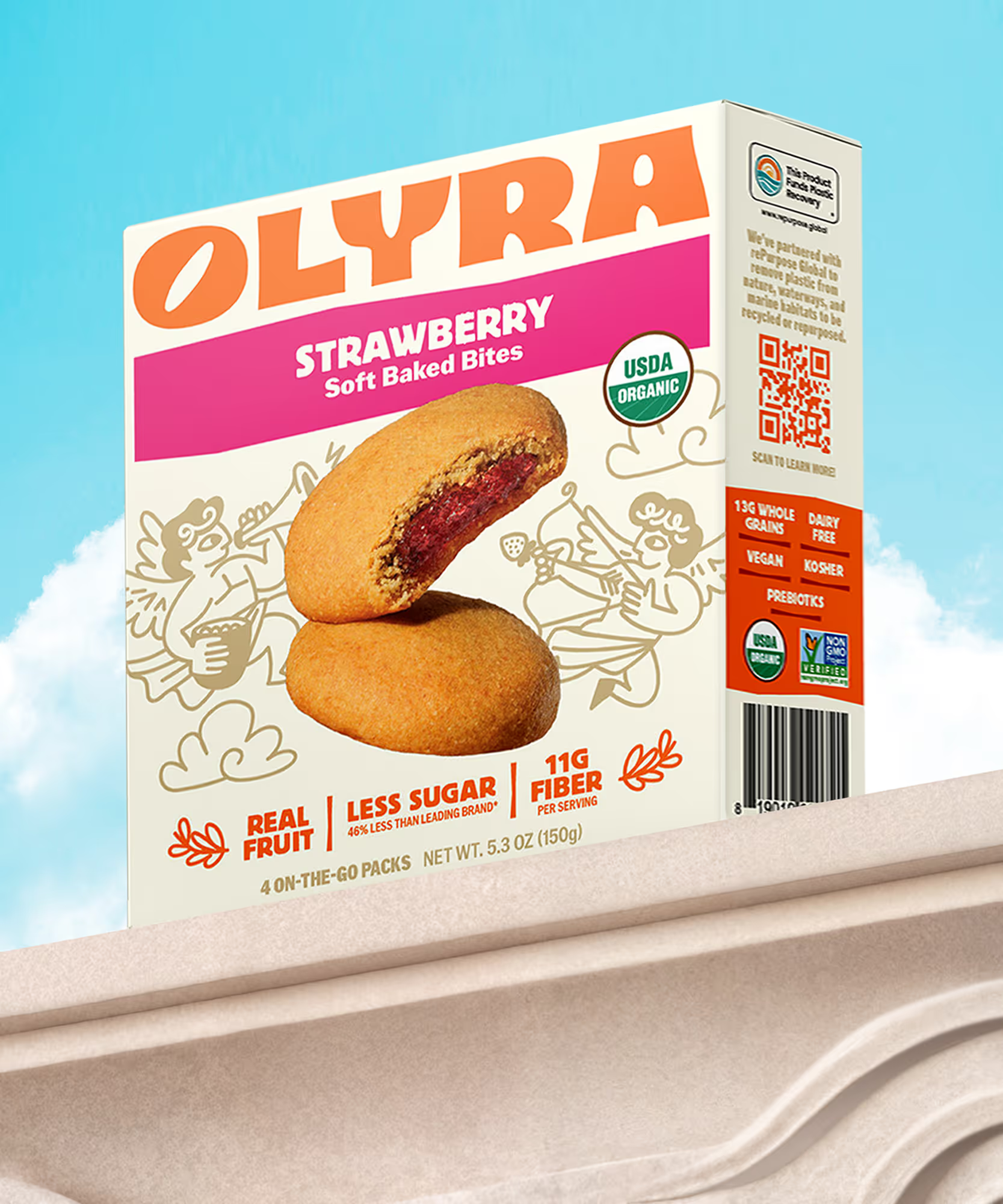
Rebranding from the grain up
The first supplement you actually want to take
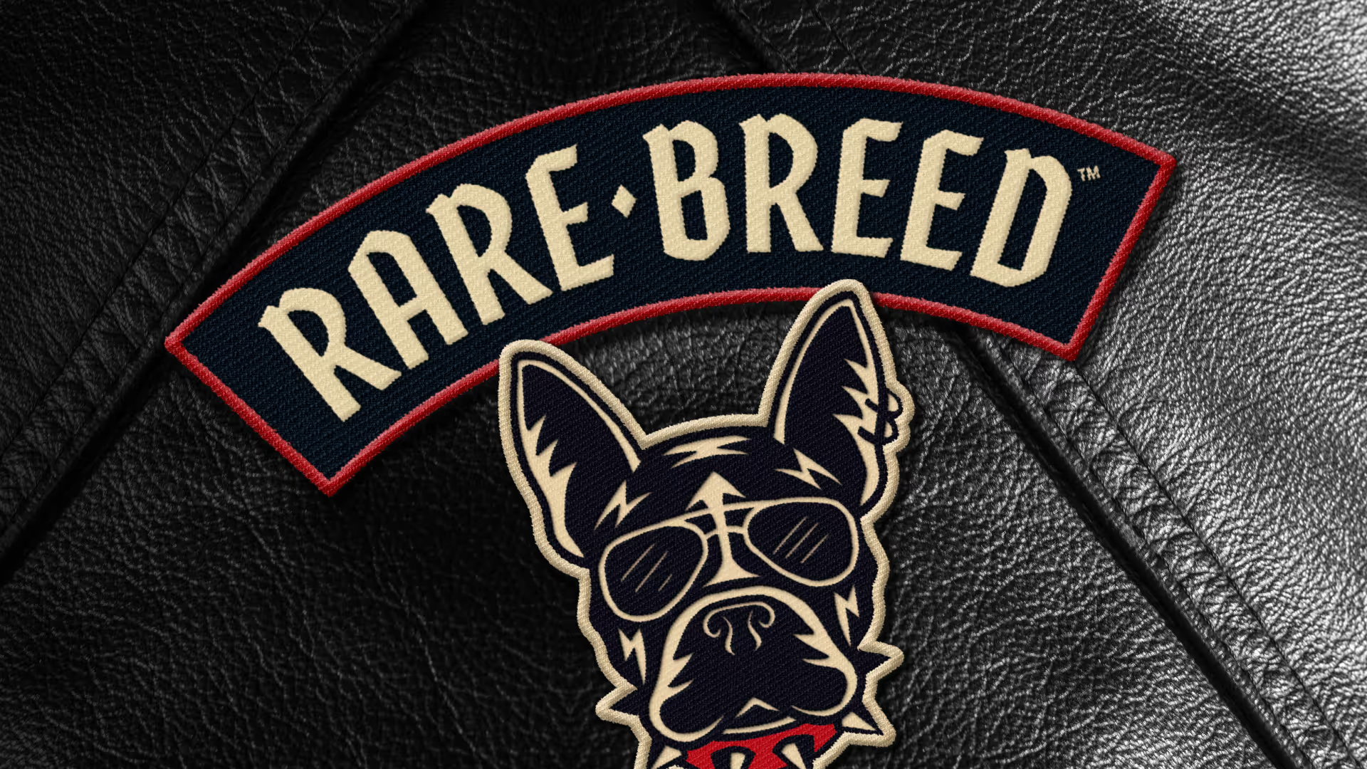
Creating a new leader of the pack

Making waves in wellness
Cereasly sexy
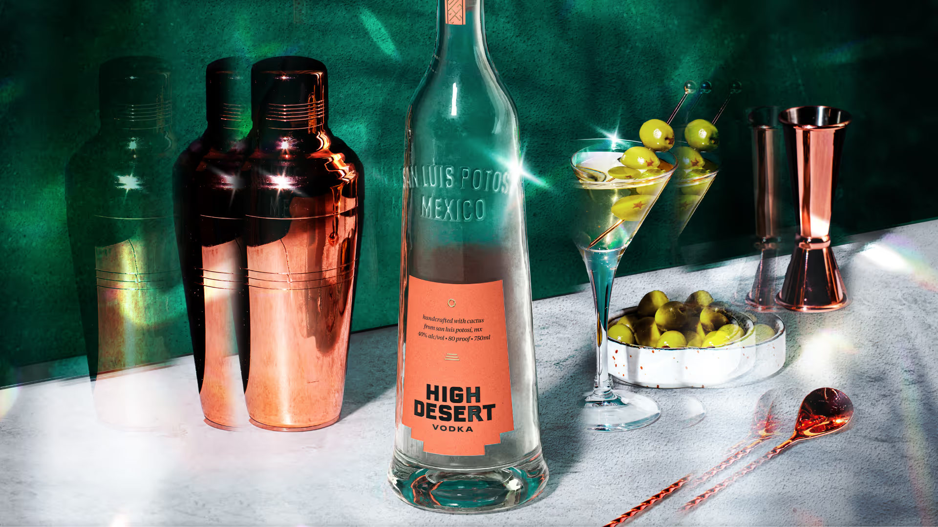
Distilling the spirit of the desert
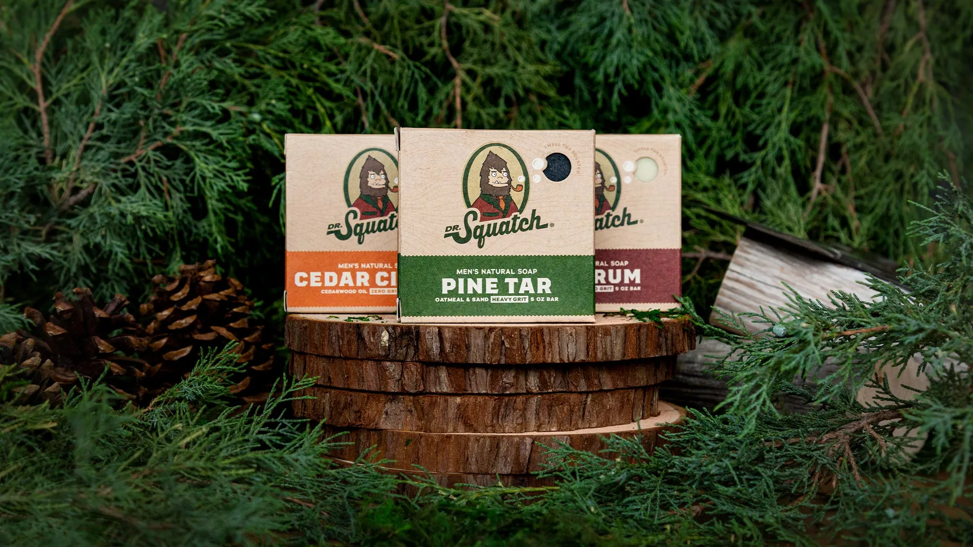
A bigfoot forward in design for men's personal care
Branding better-for-you cider
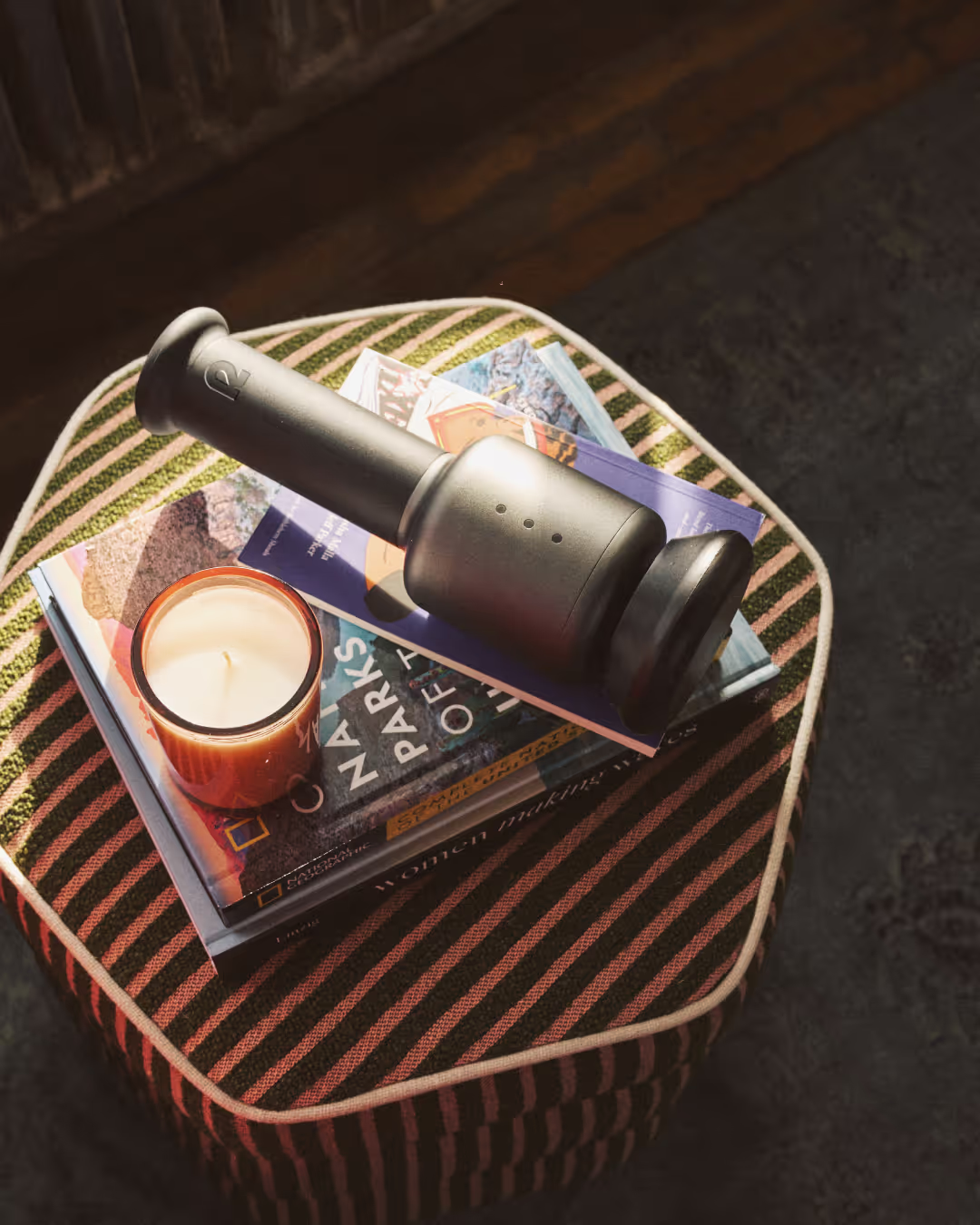
Creating a revolution in recovery

Cracking the code on healthy eating
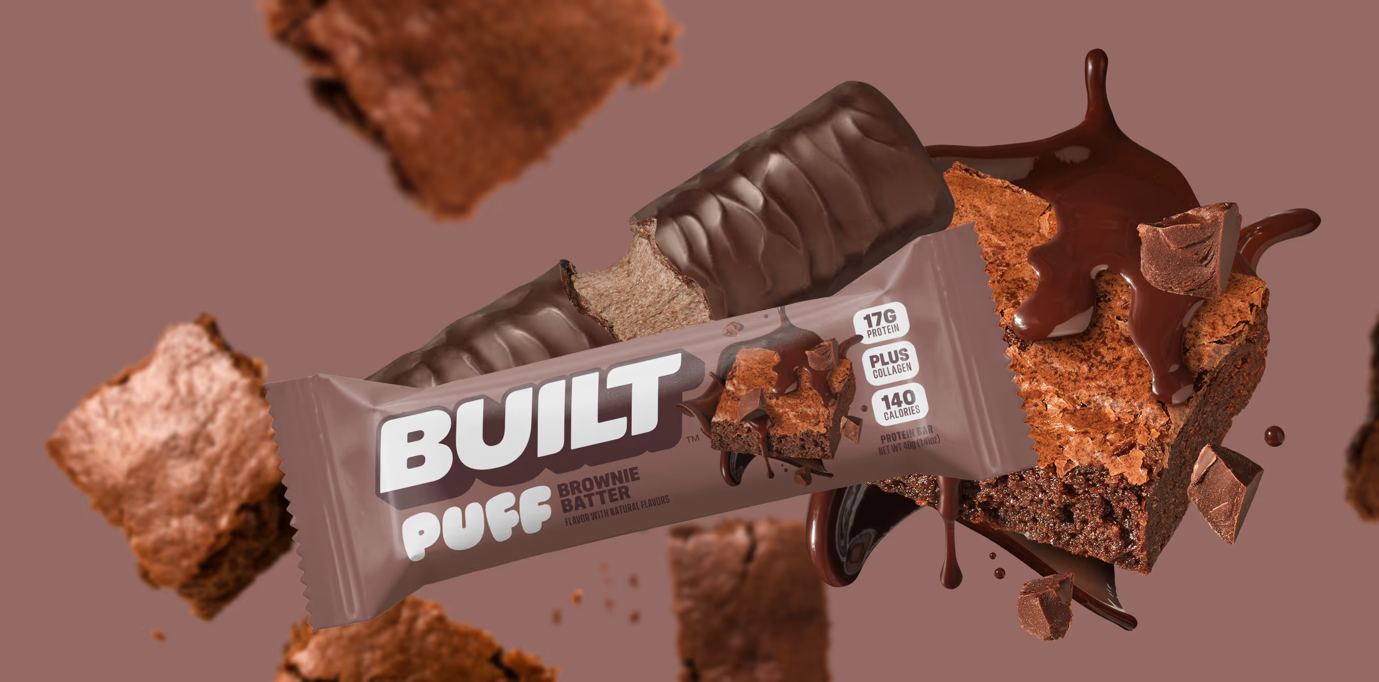
Satisfaction without sacrifice

Crafting the new generation of non-alc cocktails