Plunge
Making waves in wellness
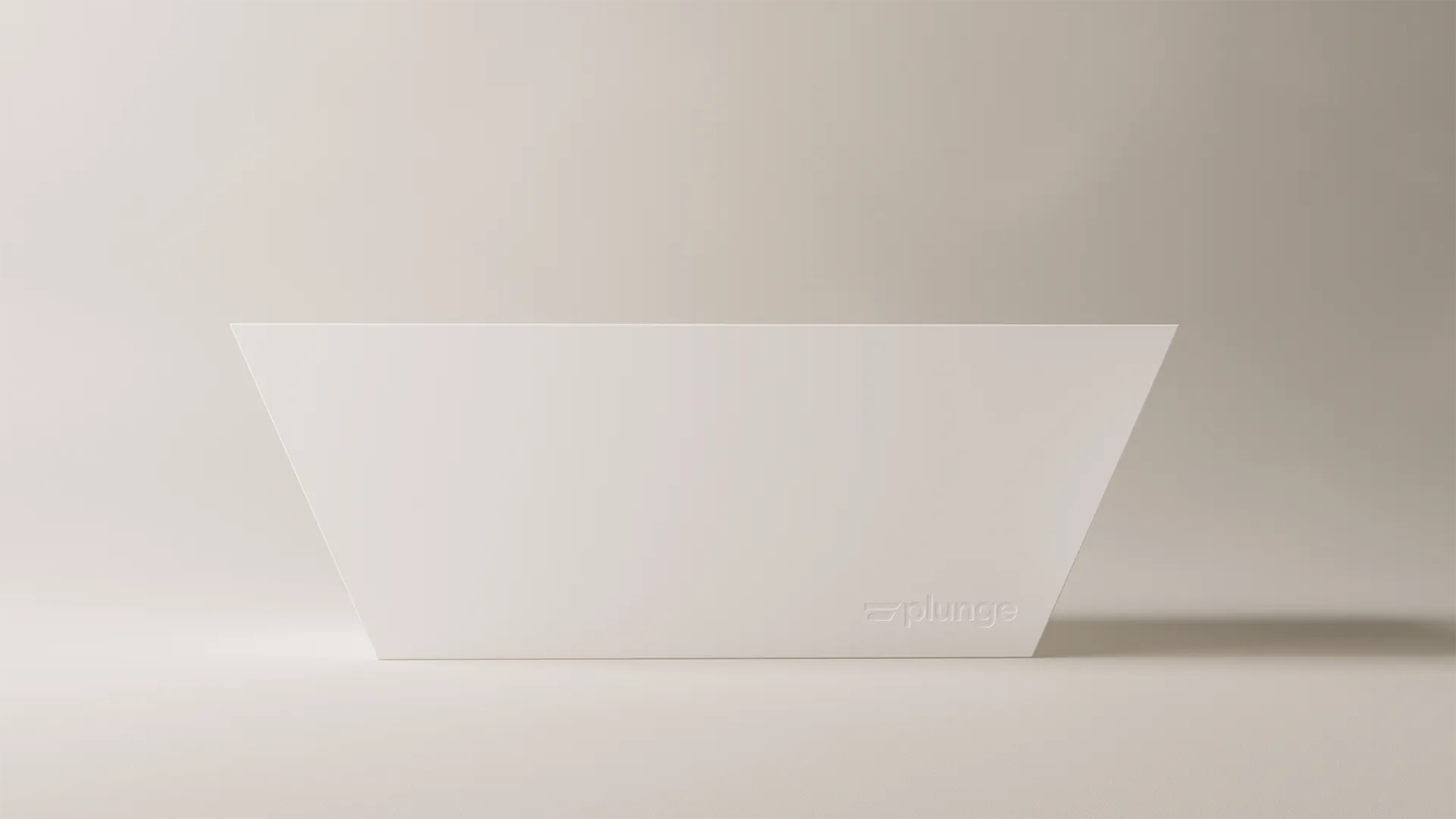
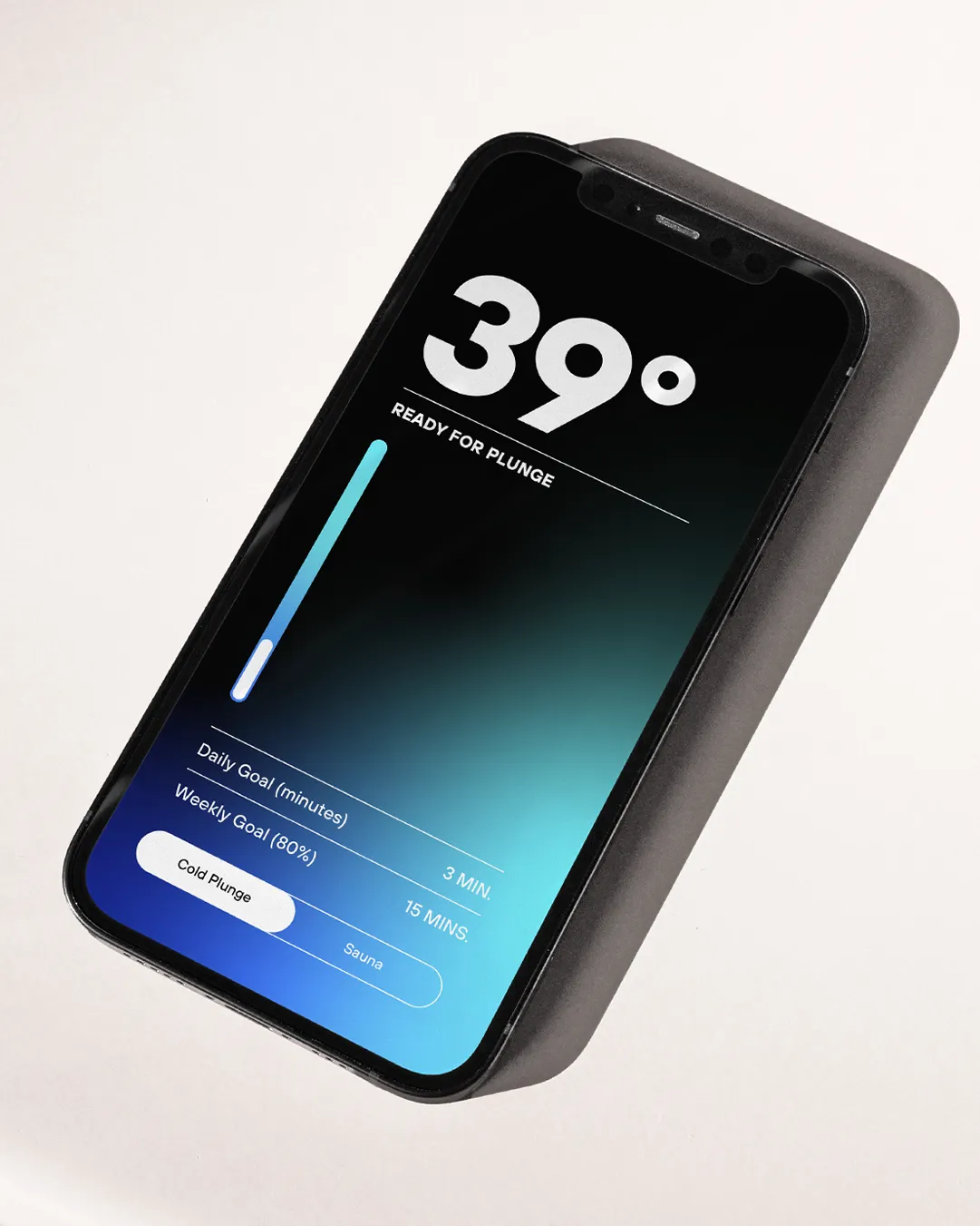
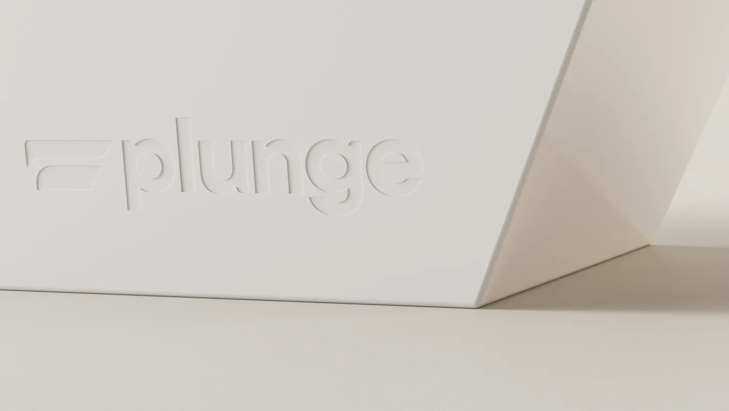
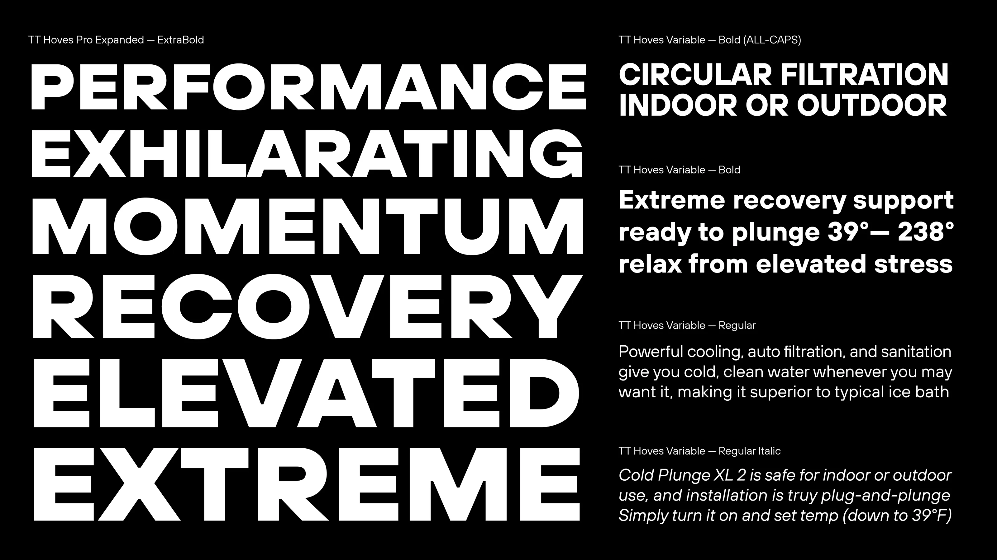
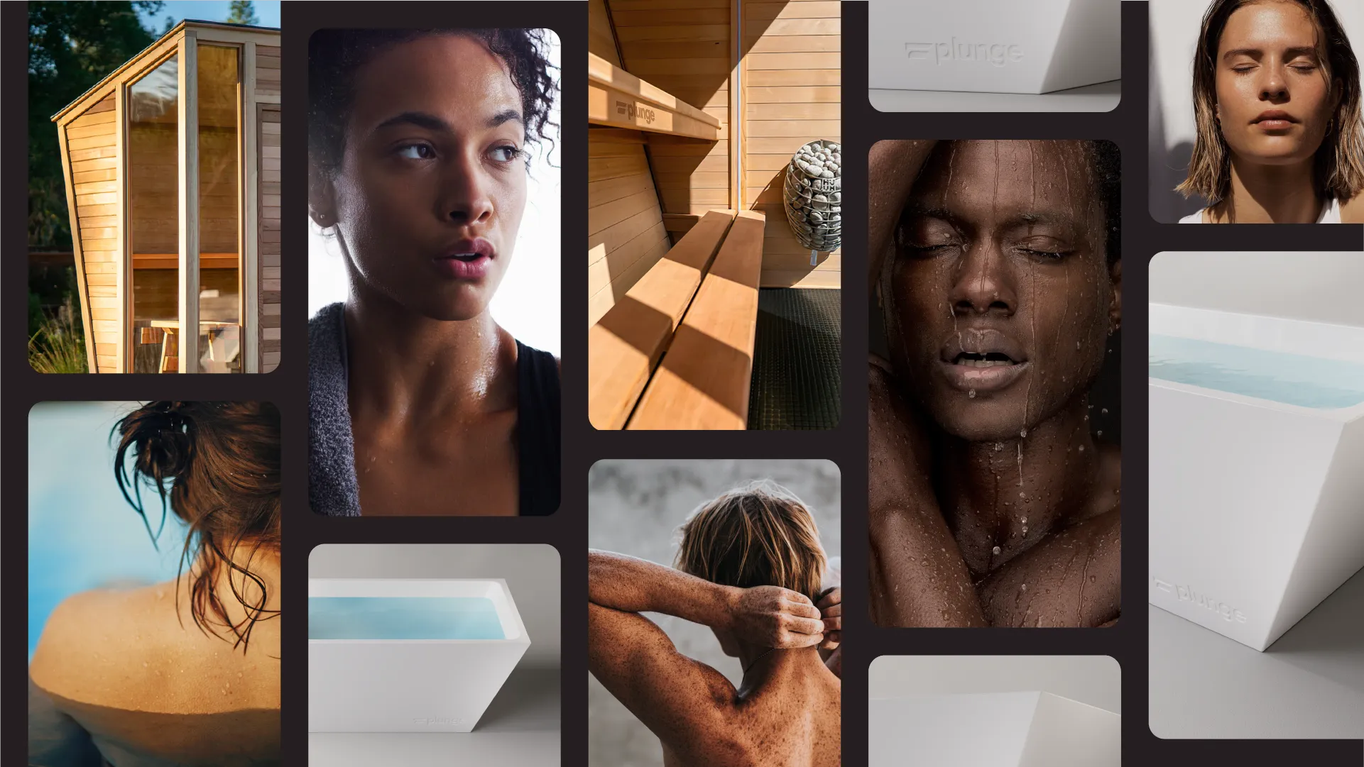
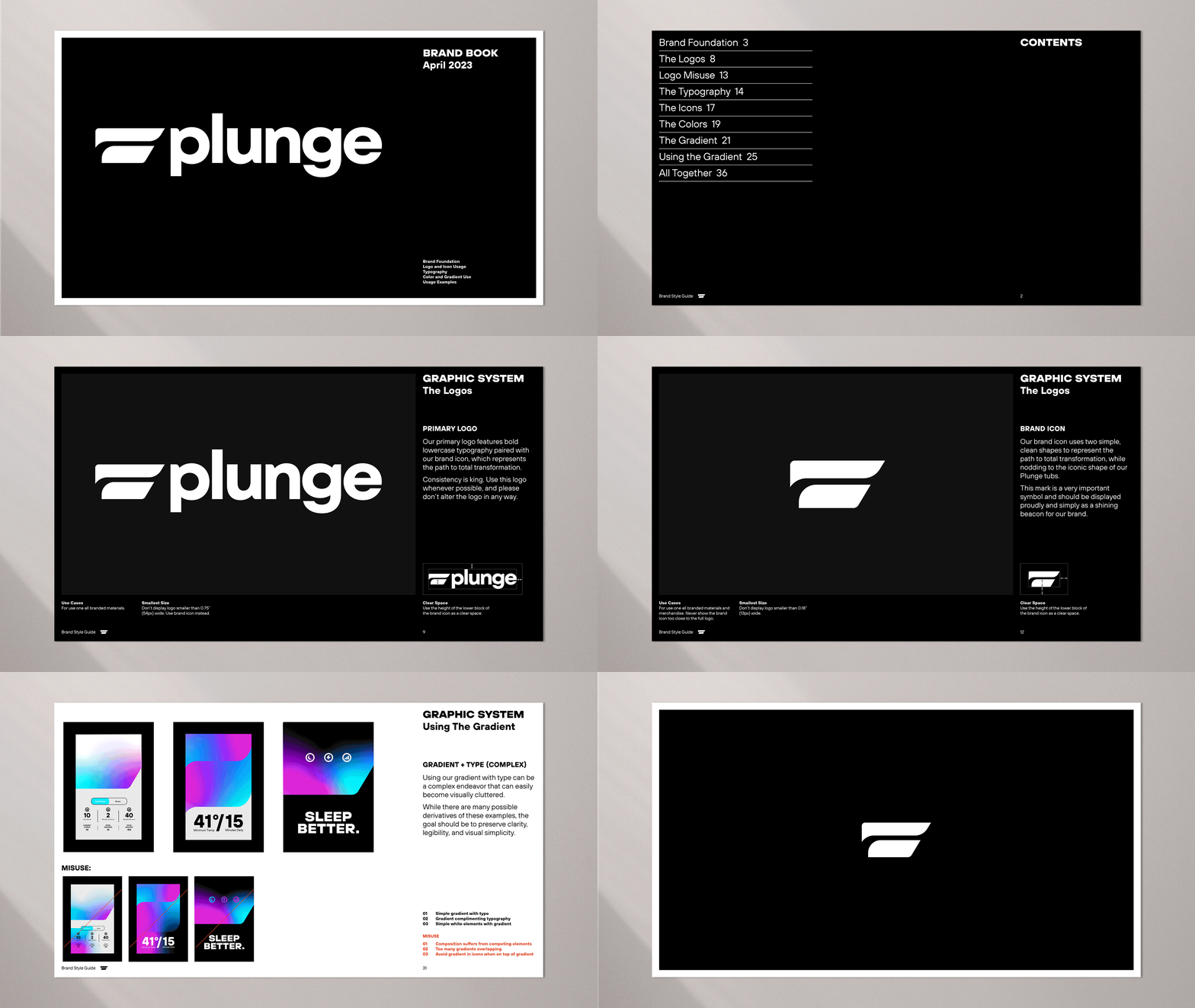
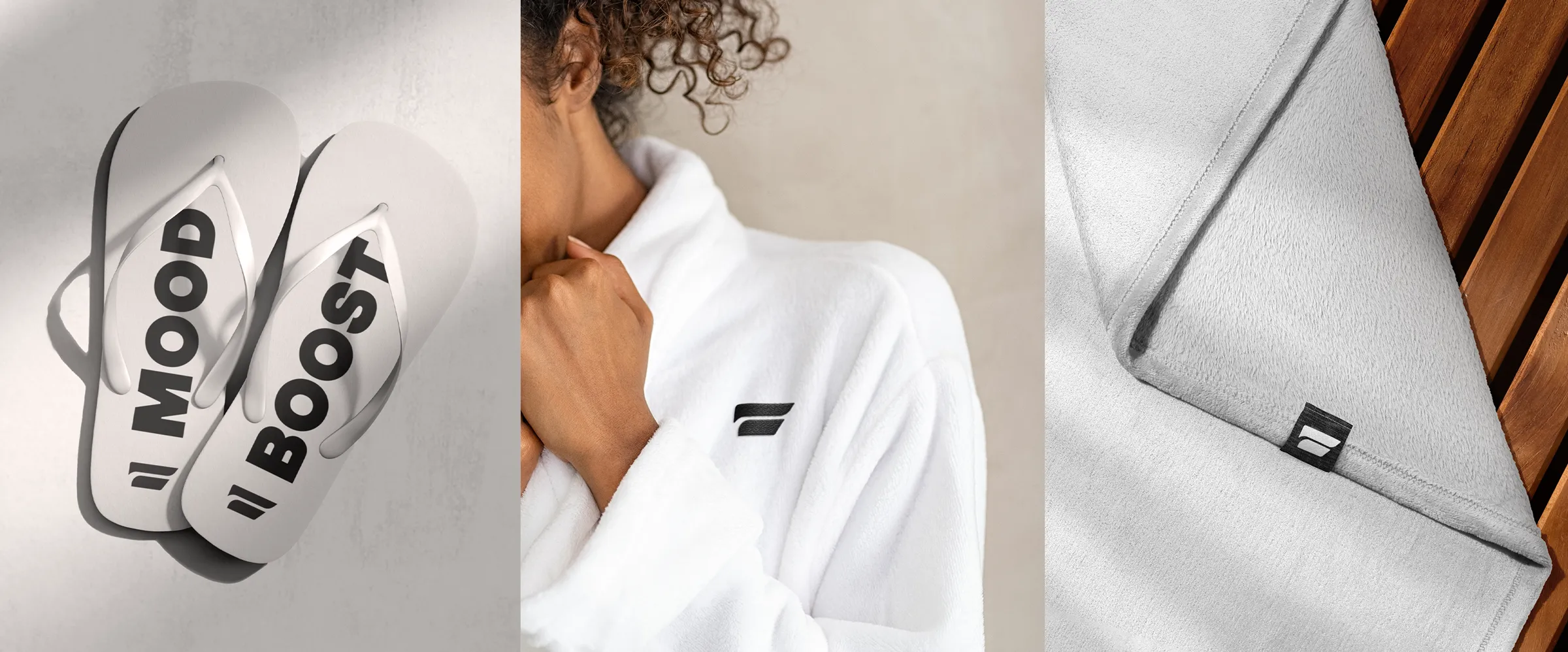
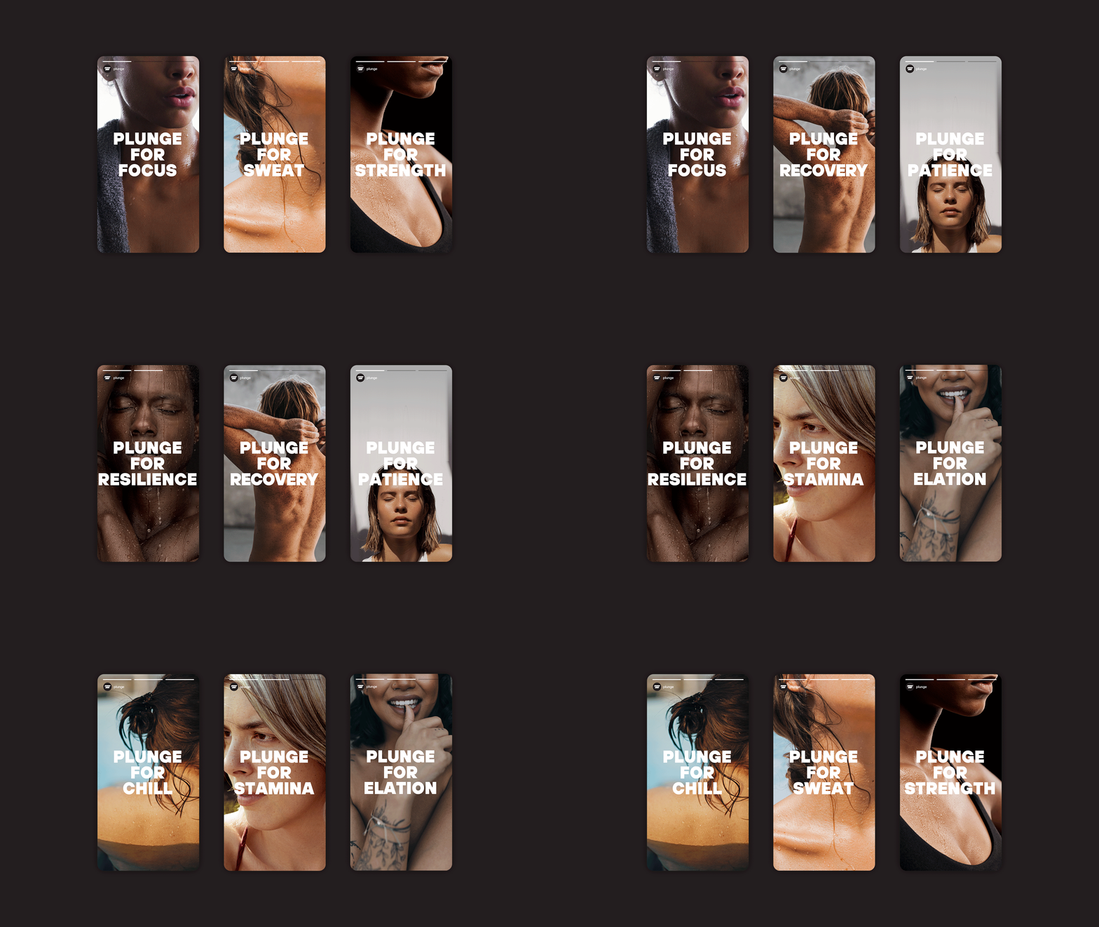
Interest in cold plunging has increased by 655% over the past year, emerging as a leader in the wellness space. As the market has gotten hotter, there’s been a lack of at home options that can range from DIY to ultra-premium. Enter, Cold Plunge. With a rapidly growing business, they came to us to reposition them to “Plunge” and help level up their look & feel, allowing them to continue to evolve and introduce new forms of wellness (hello, sauna!) to the market.
Brand Strategy
Tone of Voice
Copywriting
Visual Identity
Brand Style Guide



SEE MORE PROJECTS
From online obsession to retail expansion
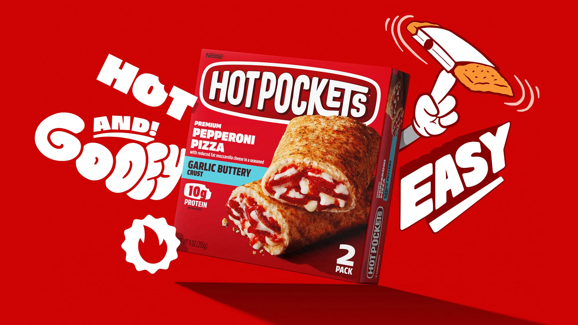
Putting the "hot" back in nestlé hotpockets.

Building on a viral sensation
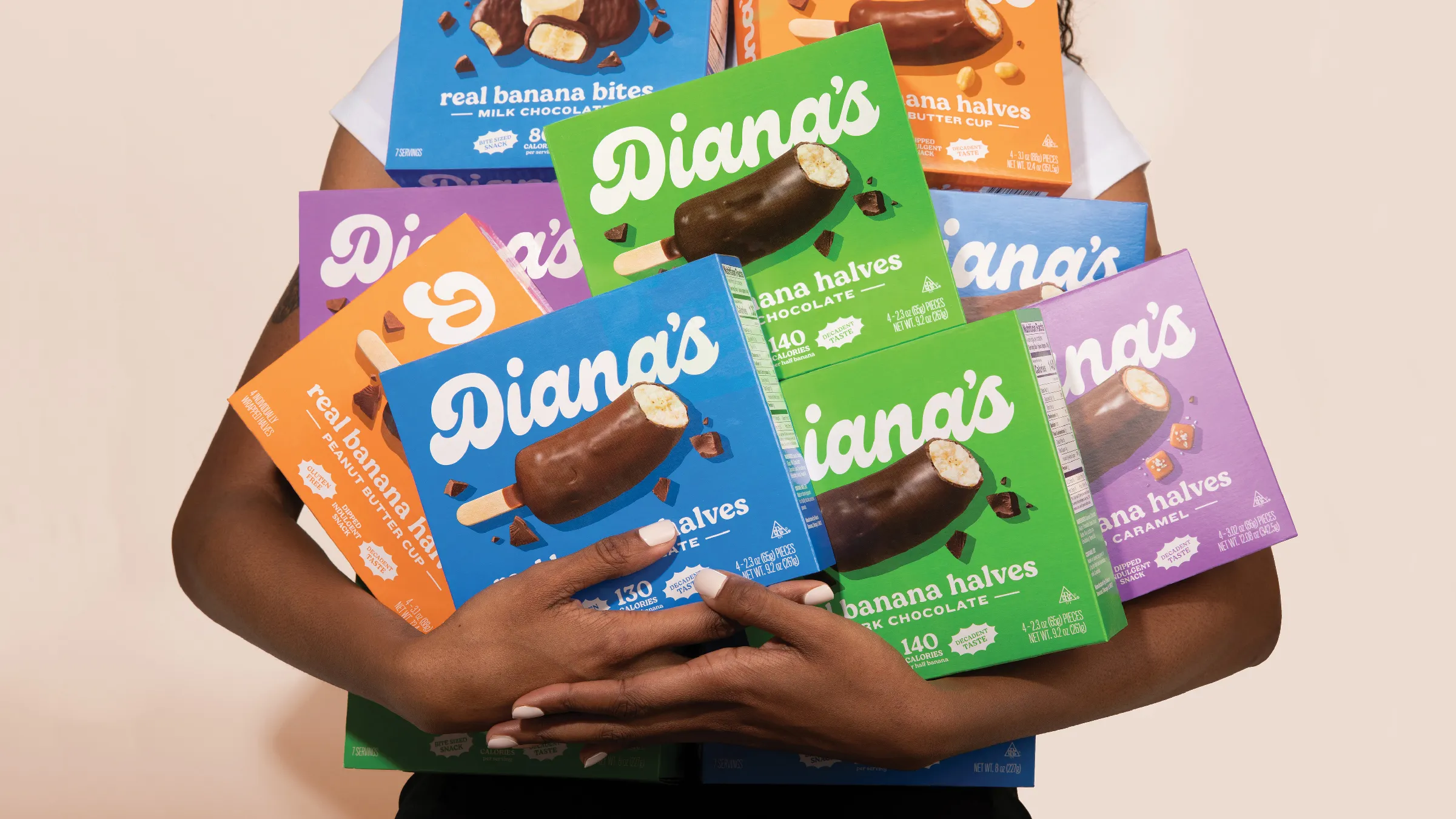
Going bananas with a classic frozen treat
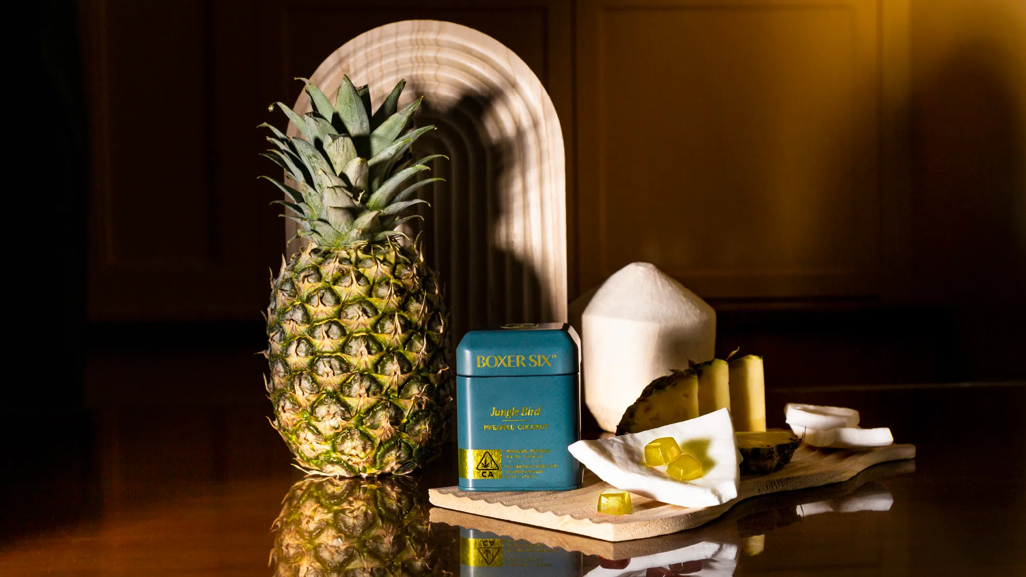
Tailored cannabis for those who tailor their lives
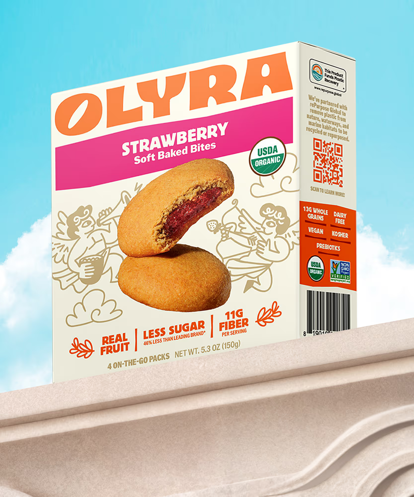
Rebranding from the grain up
The first supplement you actually want to take
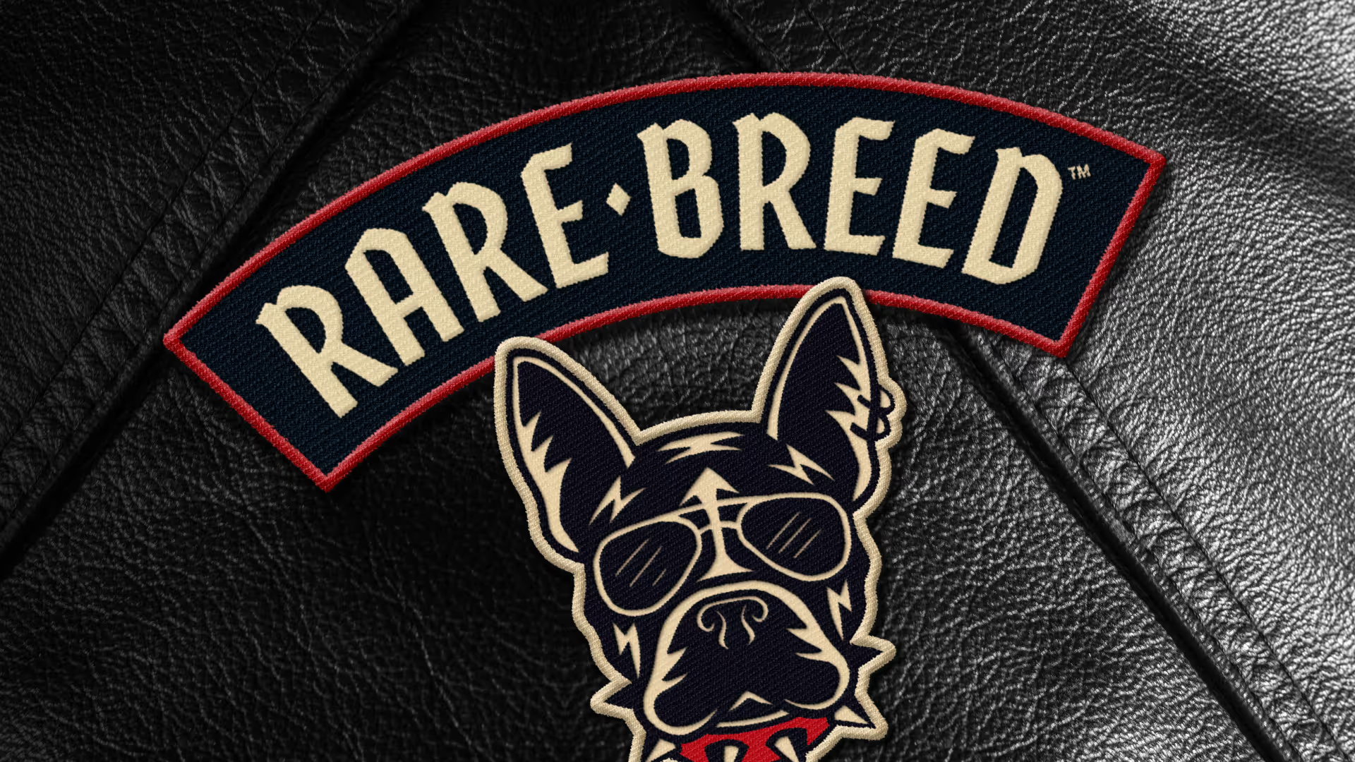
Creating a new leader of the pack

Making waves in wellness
Cereasly sexy
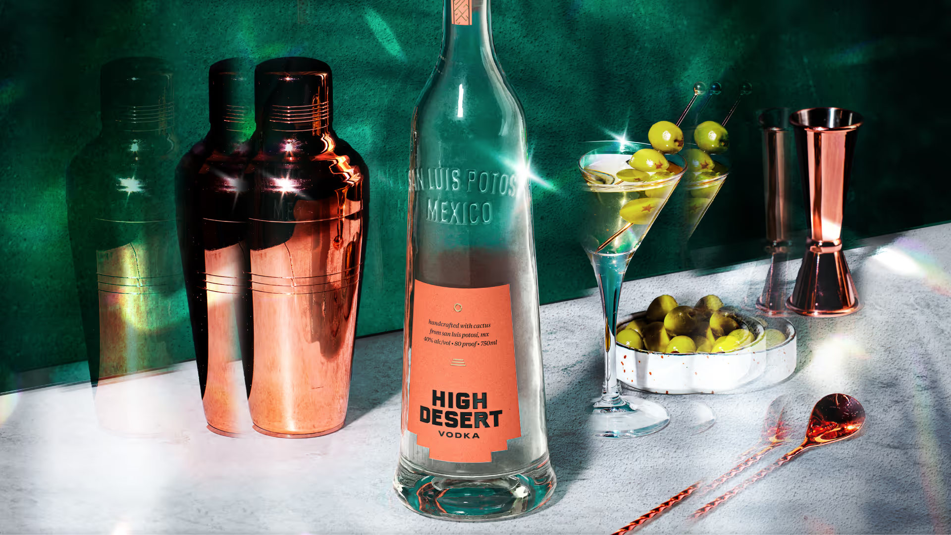
Distilling the spirit of the desert
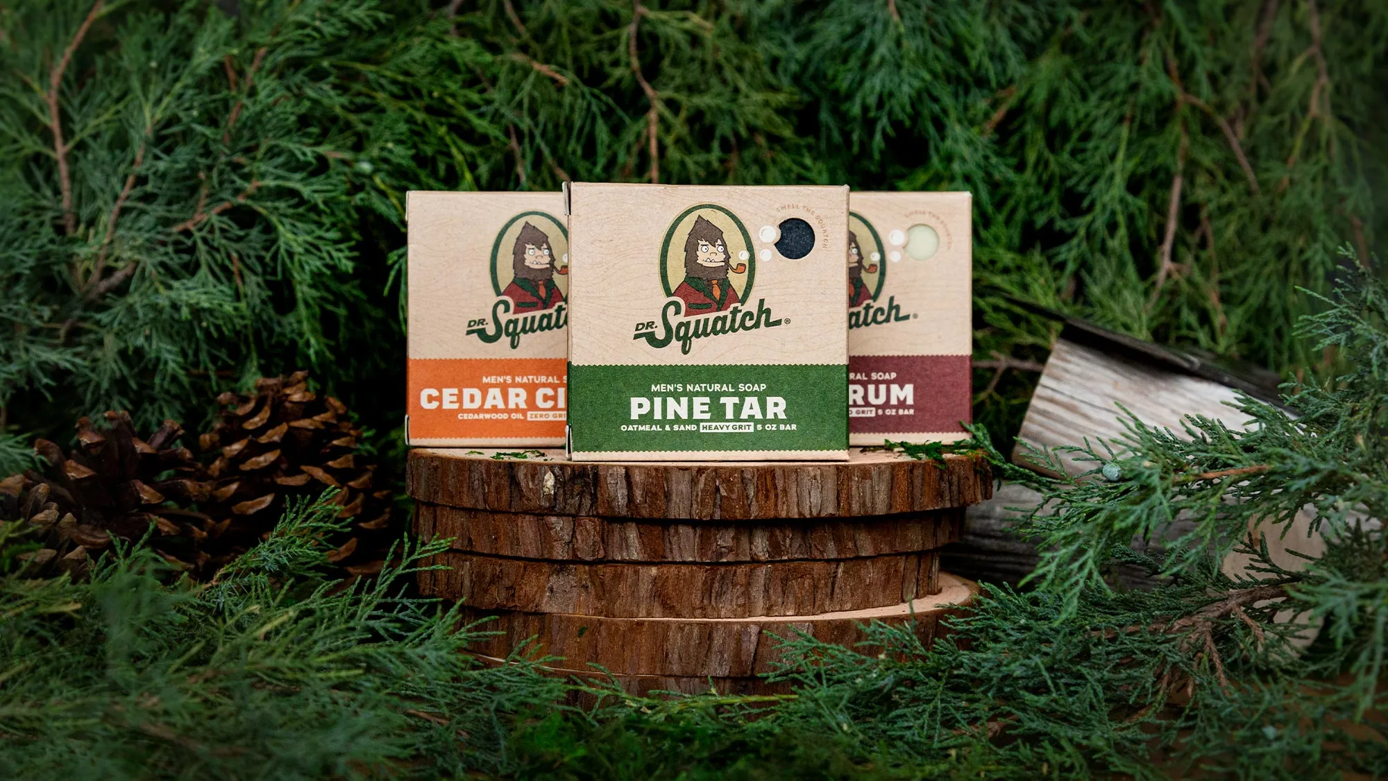
A bigfoot forward in design for men's personal care
Branding better-for-you cider
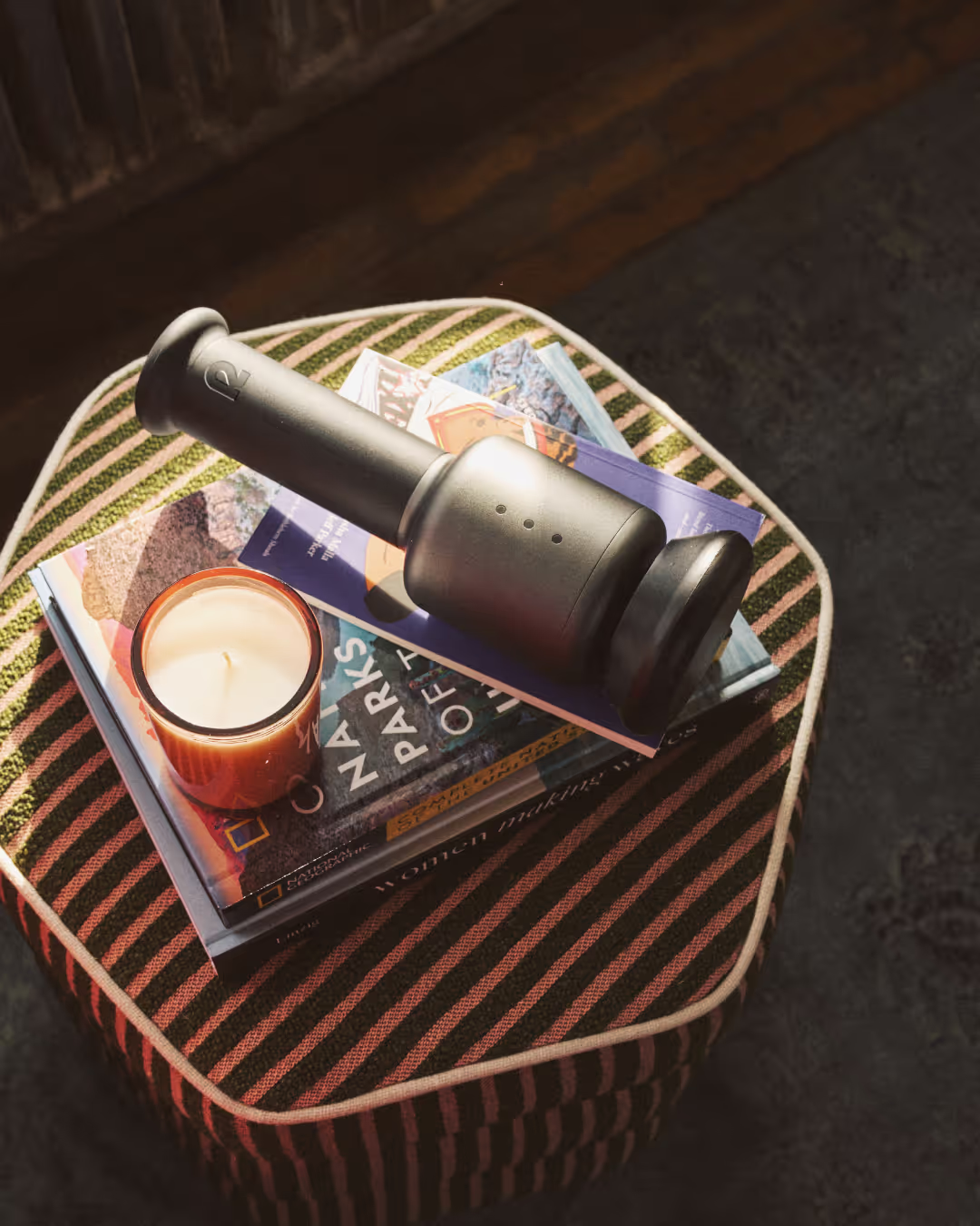
Creating a revolution in recovery

Cracking the code on healthy eating
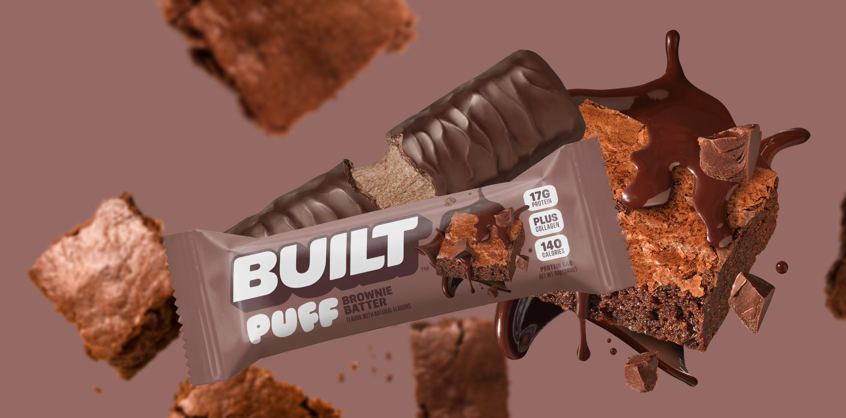
Satisfaction without sacrifice

Crafting the new generation of non-alc cocktails