GRÜNS
The first supplement you actually want to take.
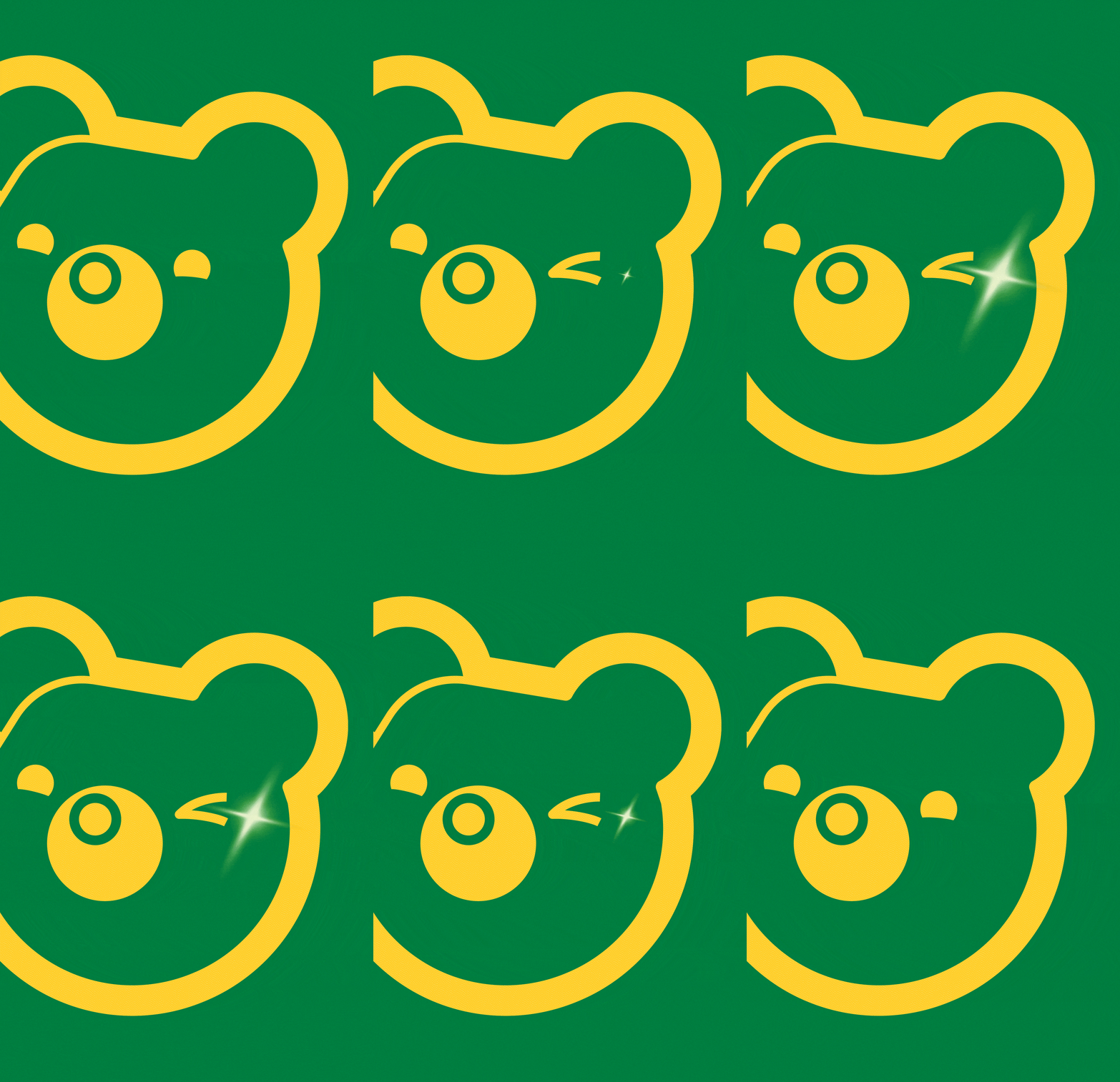
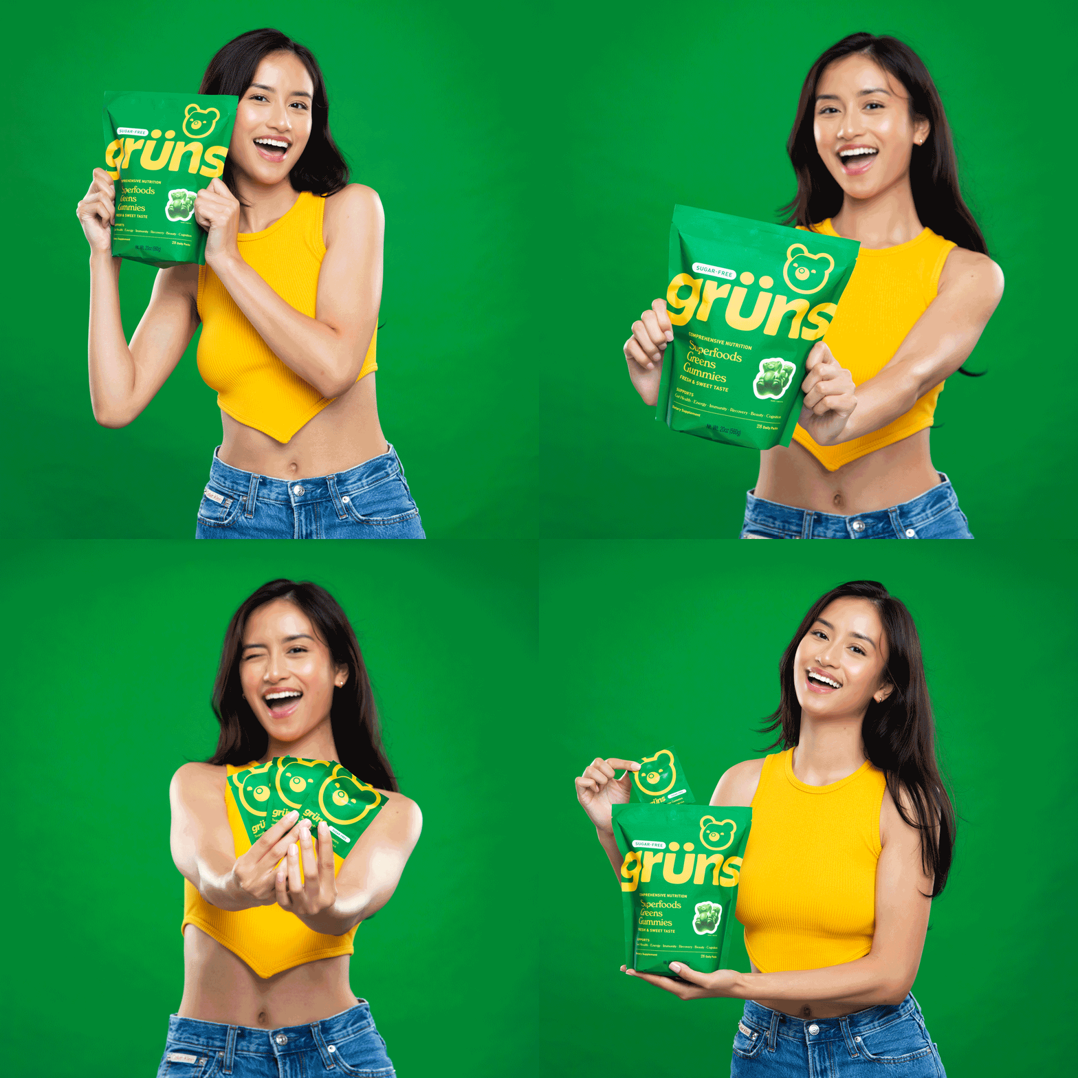
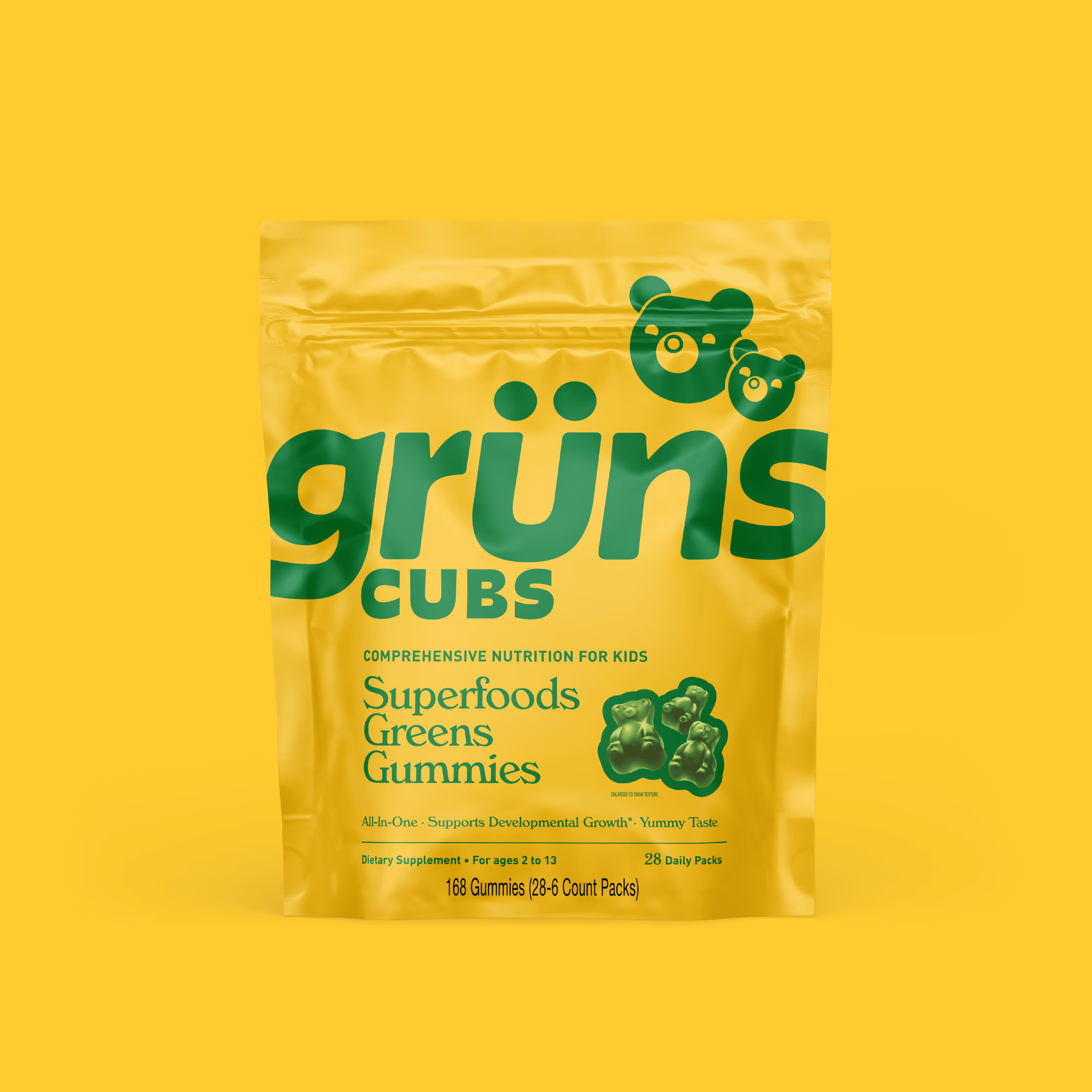
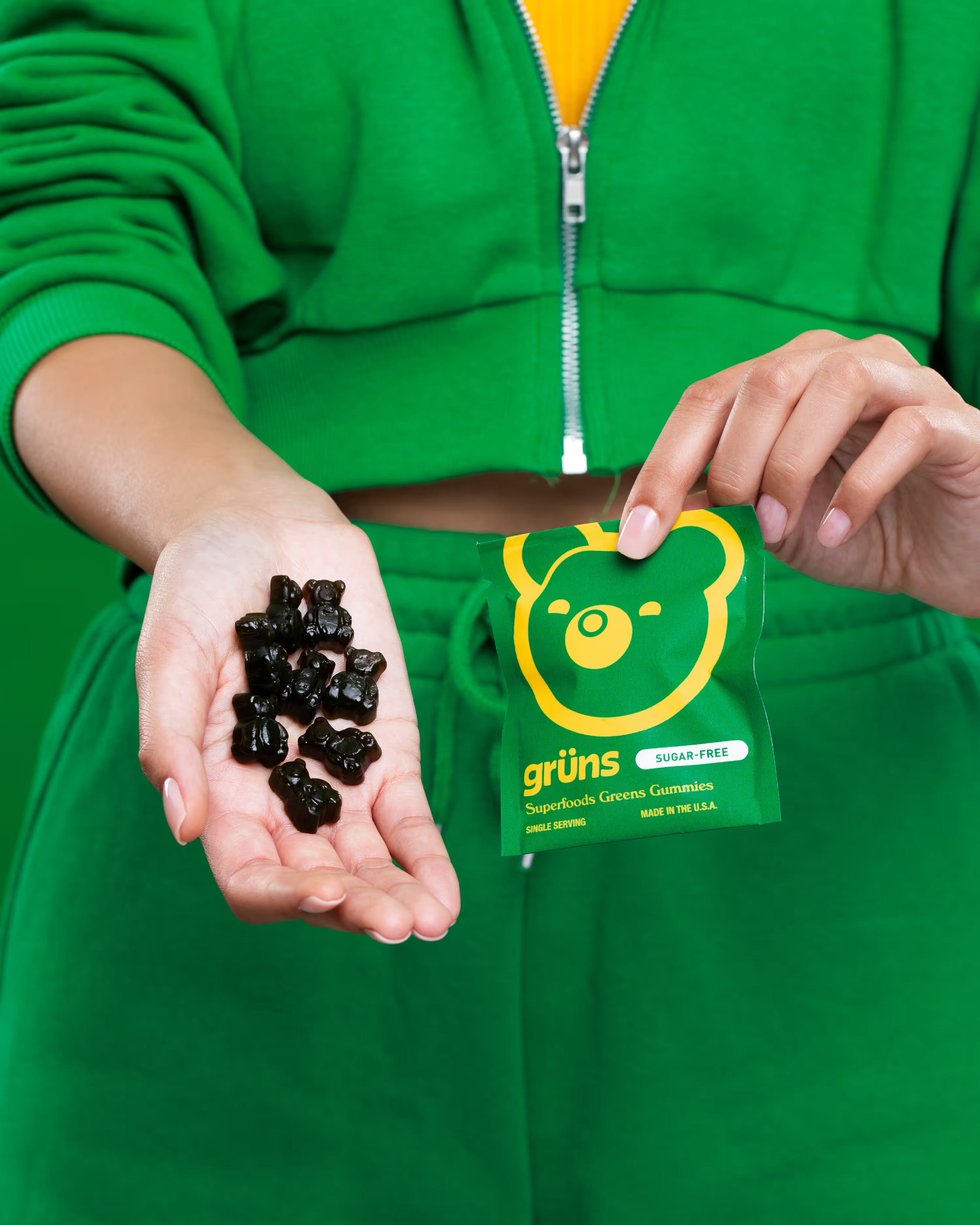
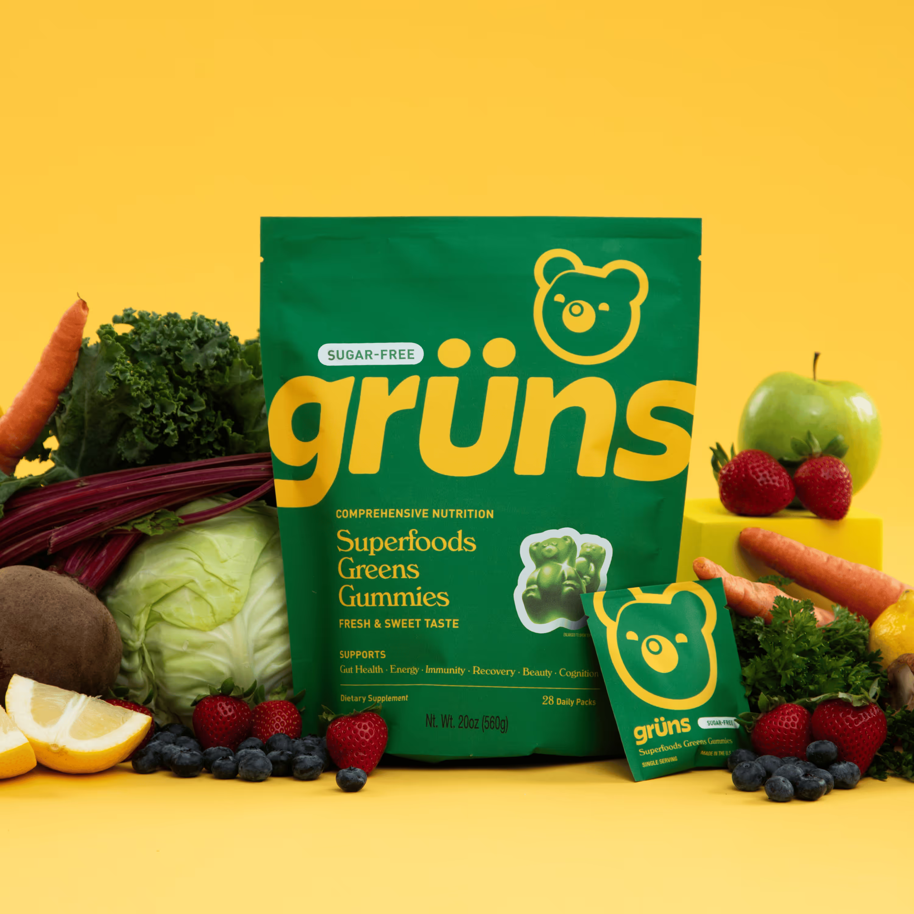
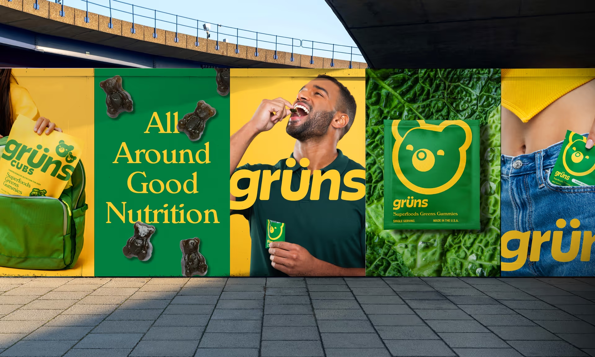
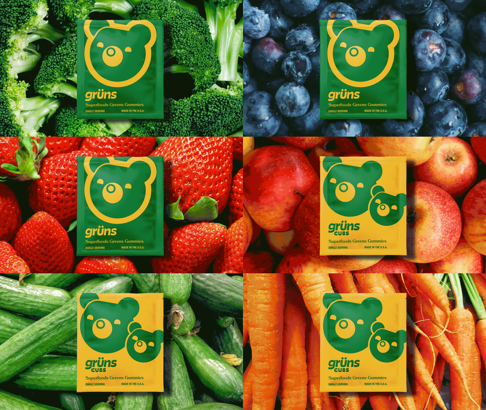
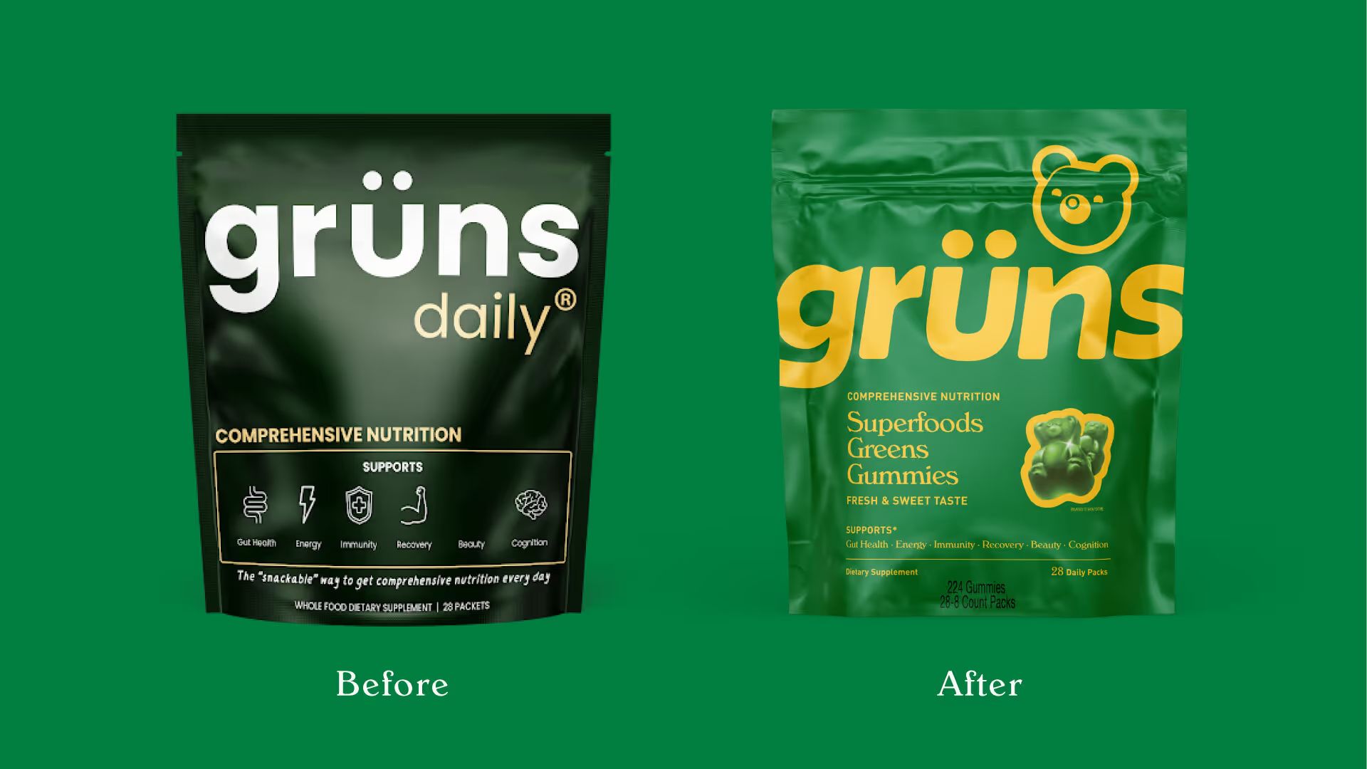
Grün's disrupted the supplements industry by transforming 60 whole-food ingredients into tasty, snackable nutrition. Their DTC success validated their playful approach, but expansion into an omnichannel strategy meant their packaging needed to work harder on shelves. Our task was to create an iconic identity balancing Grüns playful personality with scientific credibility, while showcasing both taste appeal and comprehensive nutritional benefits.
Design Strategy
Visual Identity
Typography
Packaging



SEE MORE PROJECTS
From online obsession to retail expansion
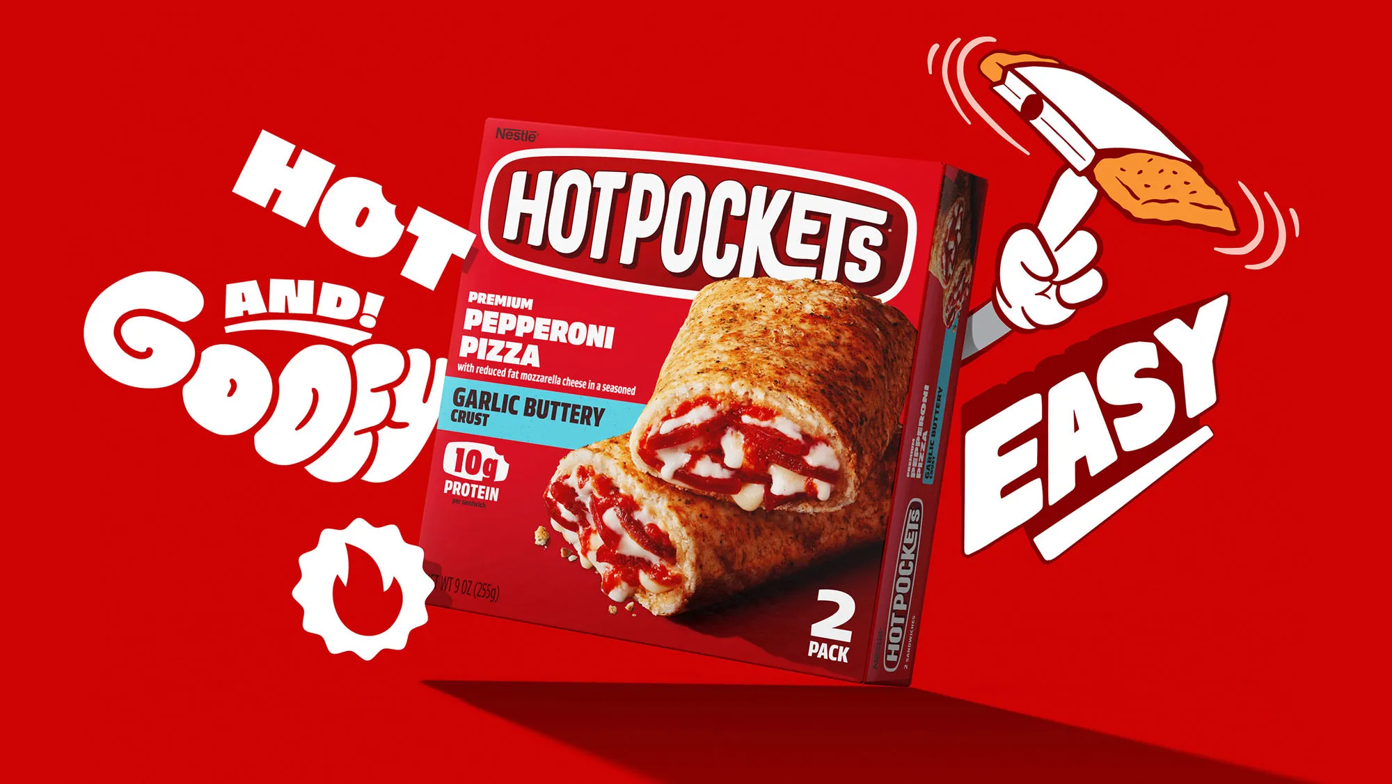
Putting the "hot" back in nestlé hotpockets.

Building on a viral sensation
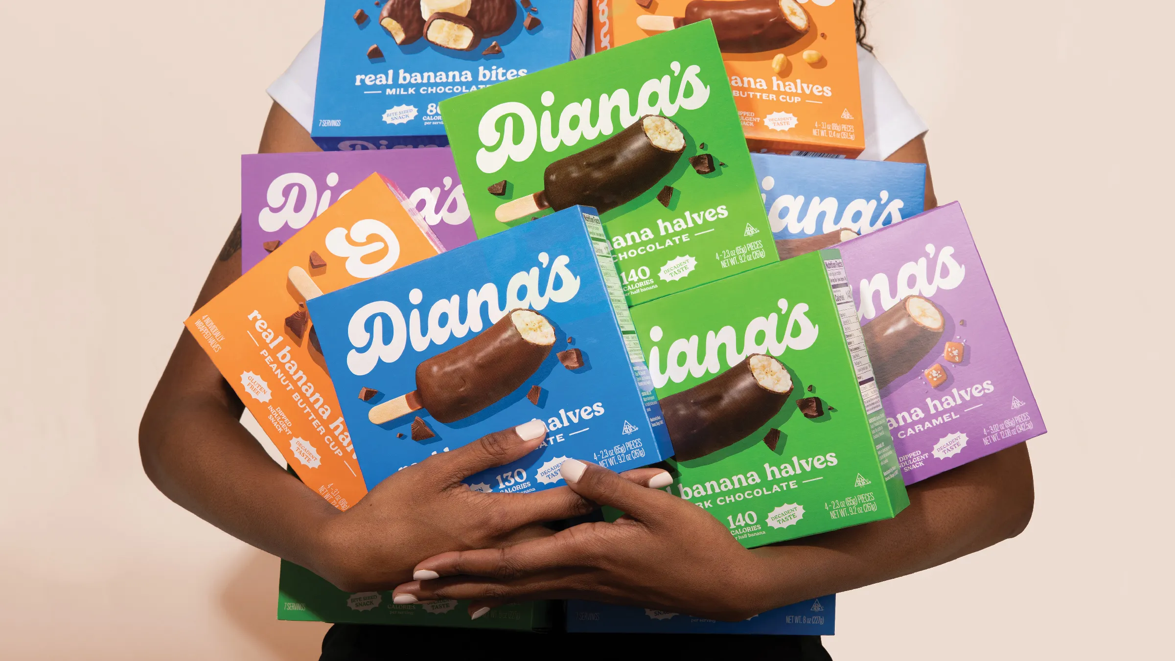
Going bananas with a classic frozen treat
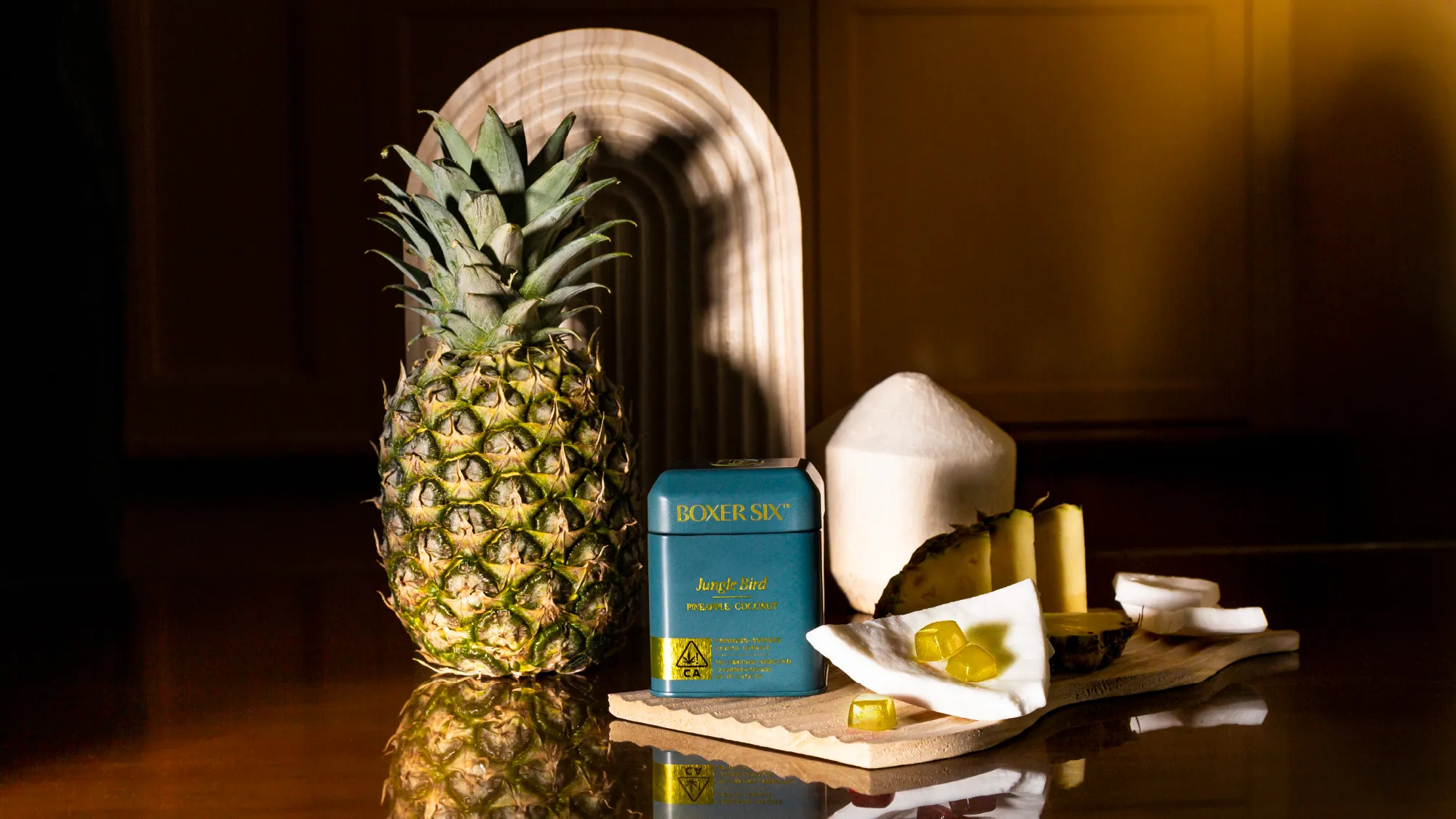
Tailored cannabis for those who tailor their lives
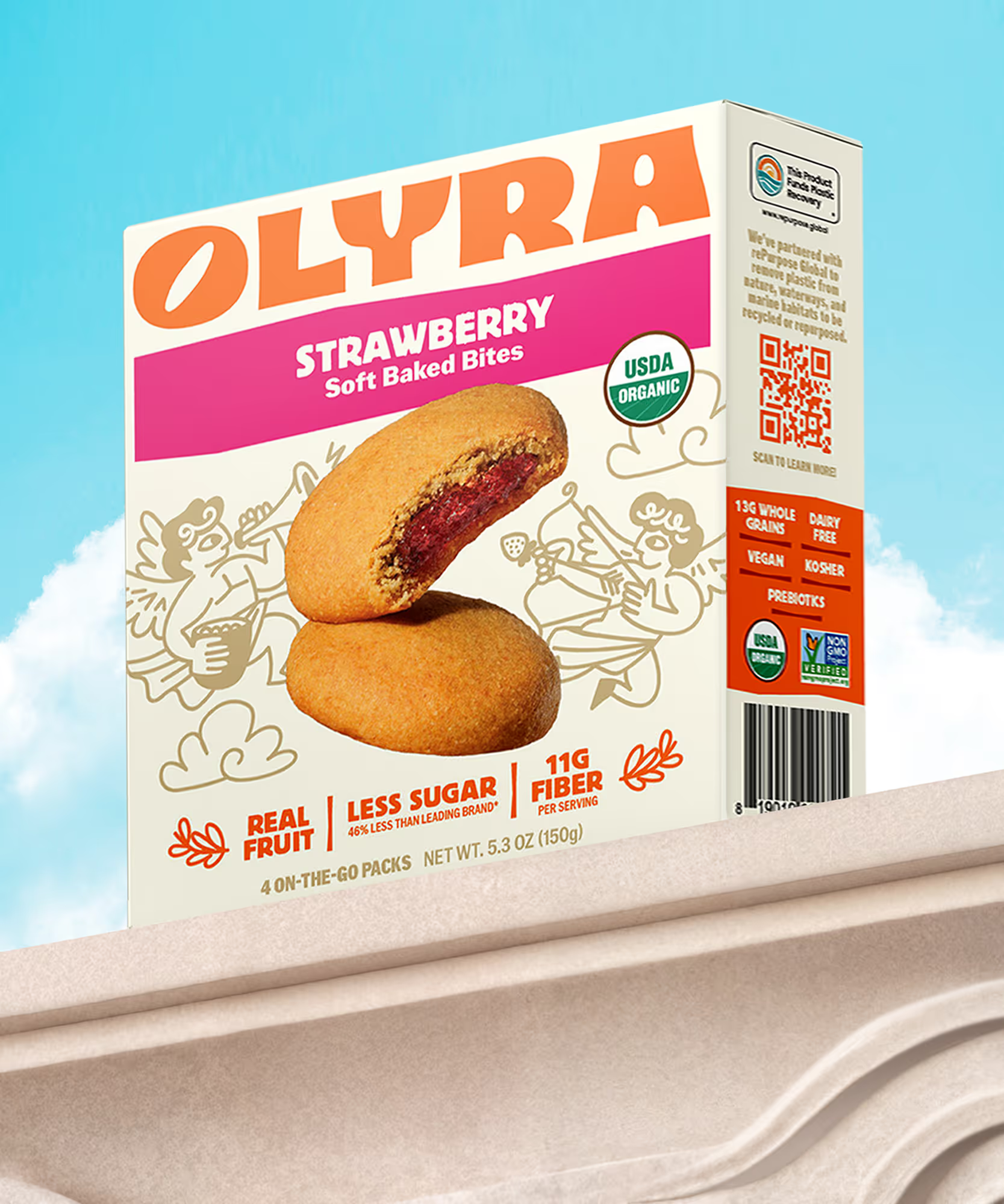
Rebranding from the grain up
The first supplement you actually want to take
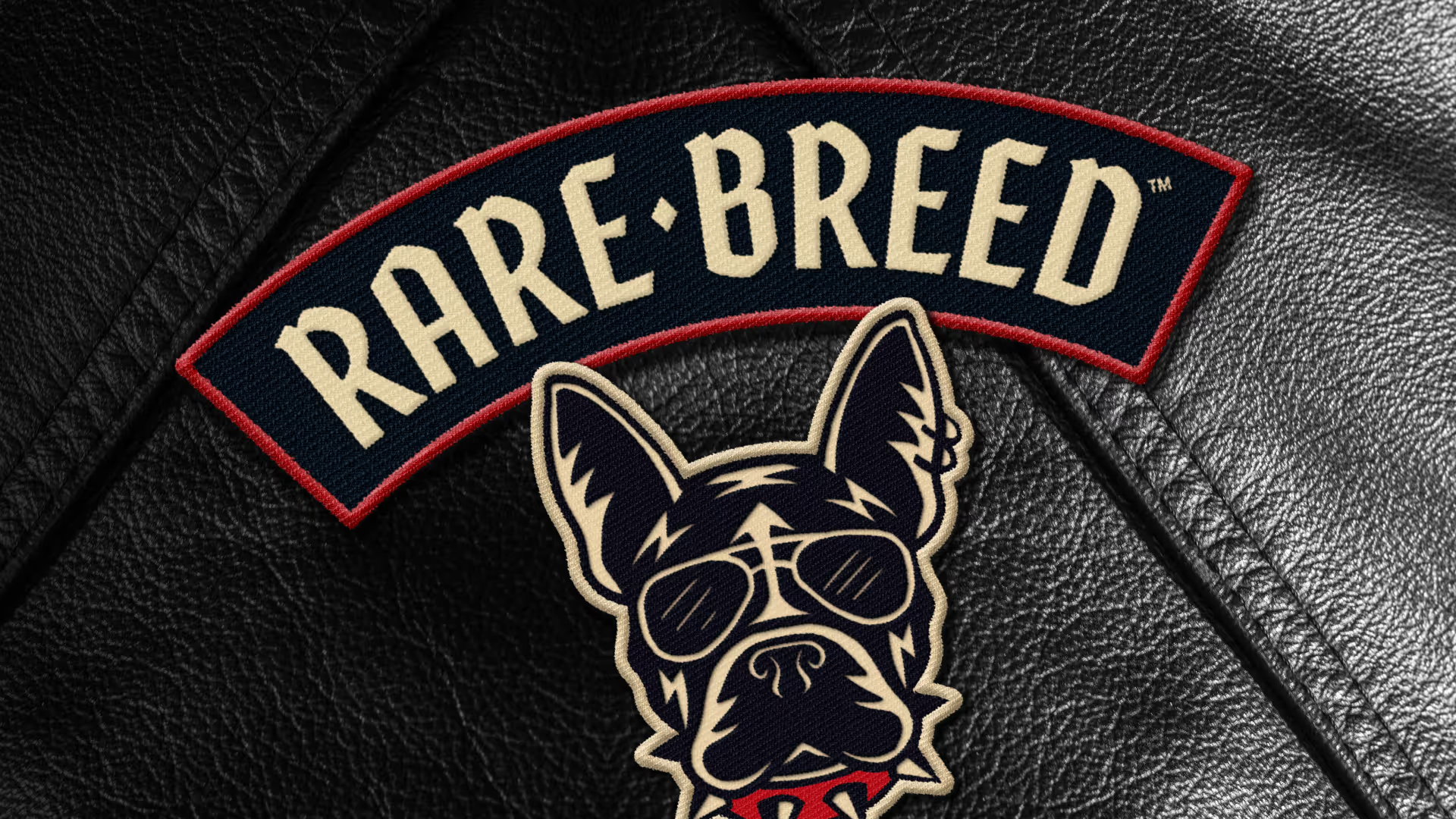
Creating a new leader of the pack

Making waves in wellness
Cereasly sexy
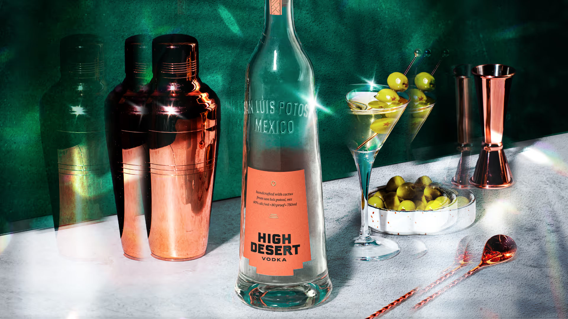
Distilling the spirit of the desert
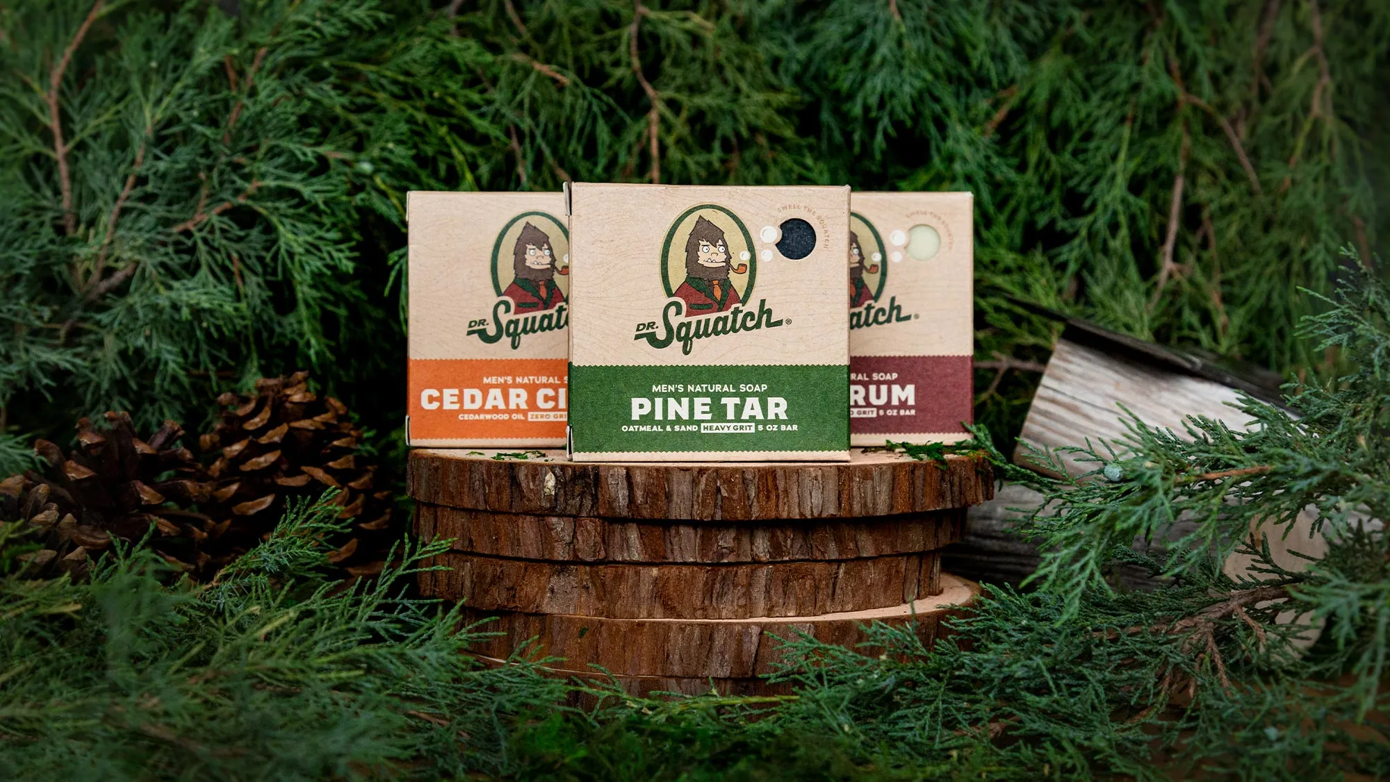
A bigfoot forward in design for men's personal care
Branding better-for-you cider
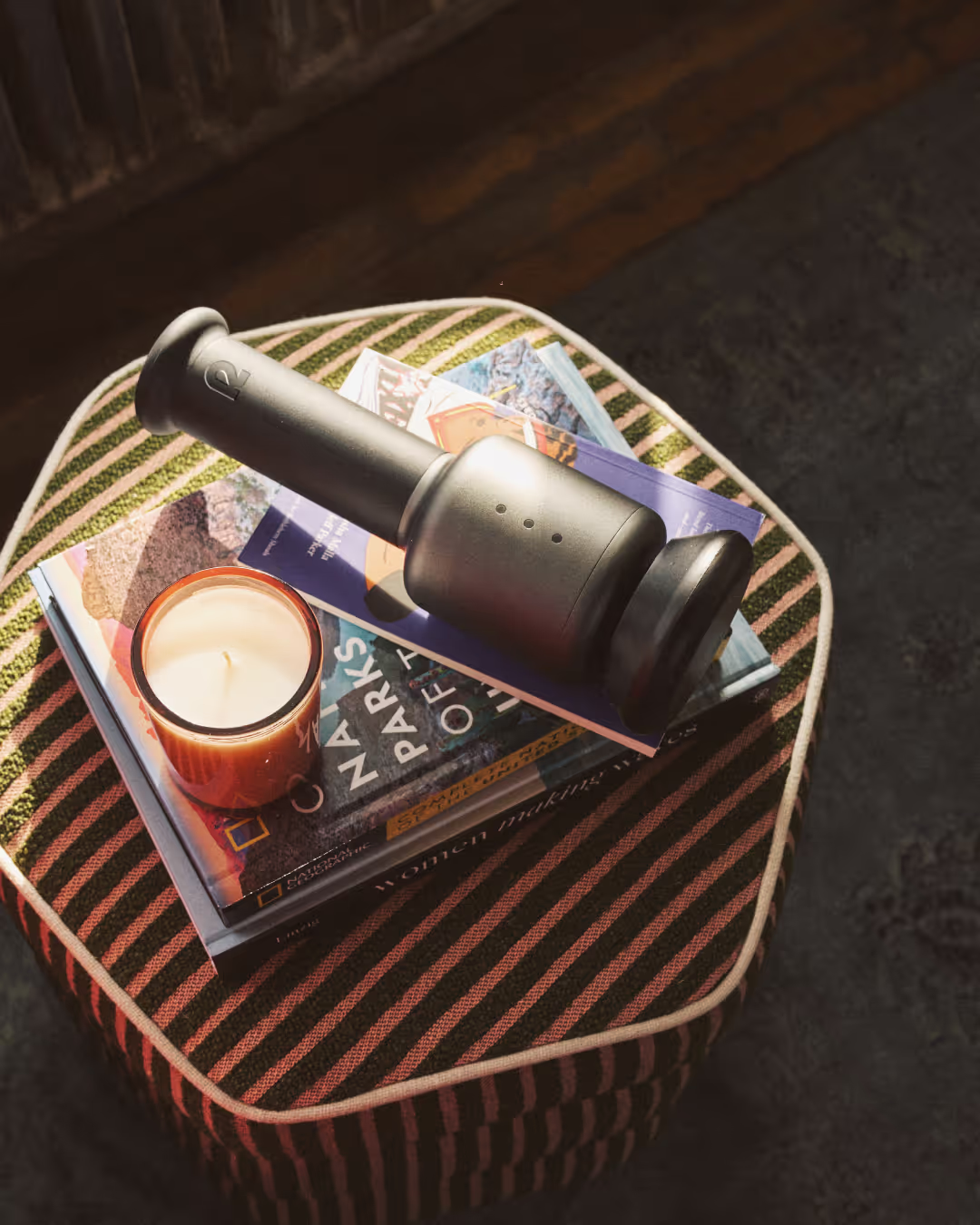
Creating a revolution in recovery

Cracking the code on healthy eating
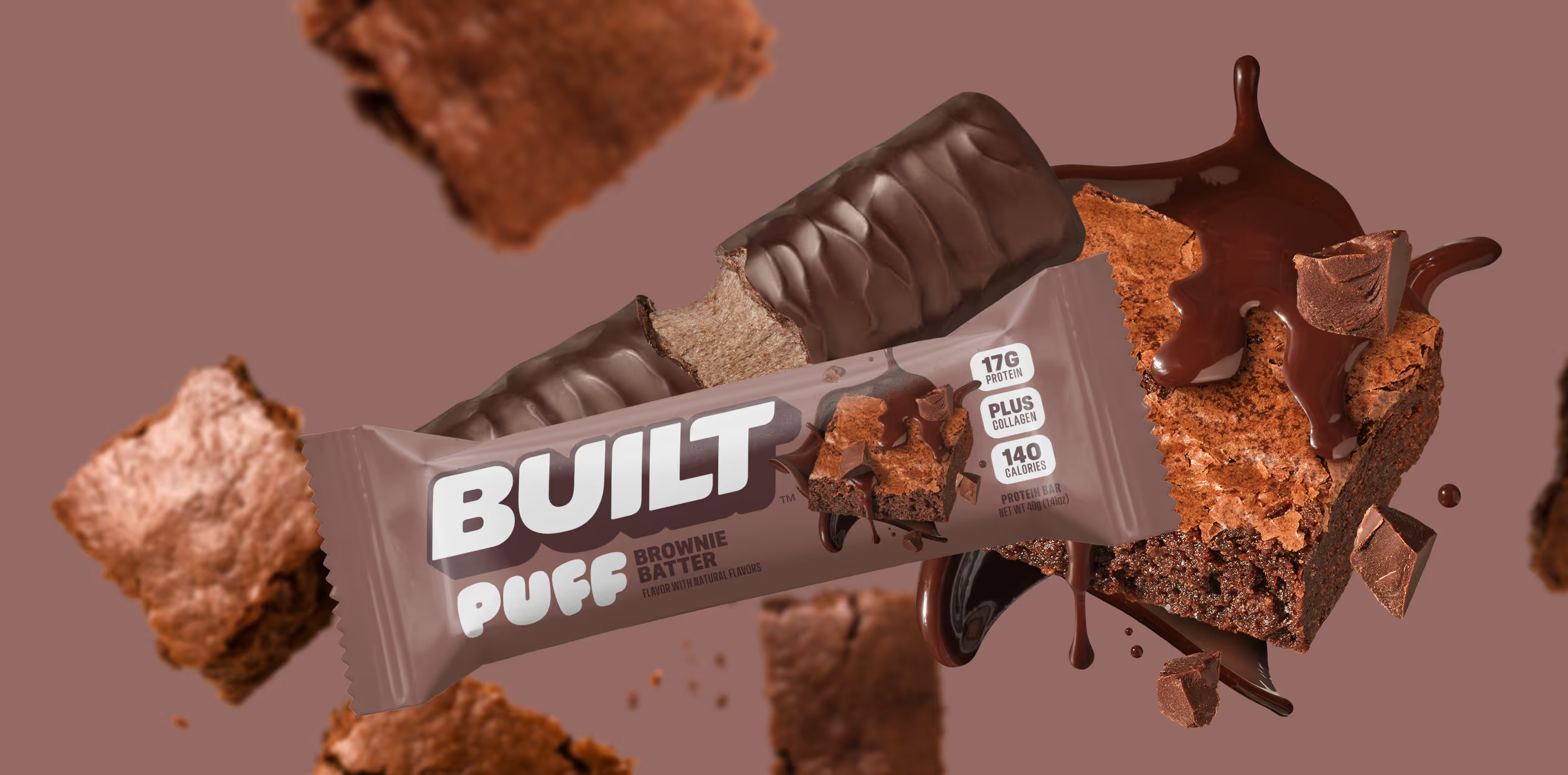
Satisfaction without sacrifice

Crafting the new generation of non-alc cocktails